Hellllo <3
Today I have a lot of scattered things to talk about! I was on vacation for most of the week so I really only had Thursday to work on stuff. I have some fun things to share regardless!!
Sometimes after a vacay, I need a little design warm up to get the brain juices flowing. My fave warm up is to design inconsequential things just for me. This time it was playlist covers for my At Desk or Club??? playlist and my Yarn Shop Girl <3 playlist.
In my jet-lagged, brain-fogged state, I focused most of my efforts on the mindless task of working on additional weights for Weightless (say that five times fast). I forgot to mention last week that there will also be a light weight! I started it a while back. I’m about halfway done adjusting the characterset and I am feeling very good about it. The graphic designer in me definitely requires a light weight. So when it’s all said and done, Weightless will have a bold, regular, and light weight with their accompanying italic styles. I am v excited about where this is going!
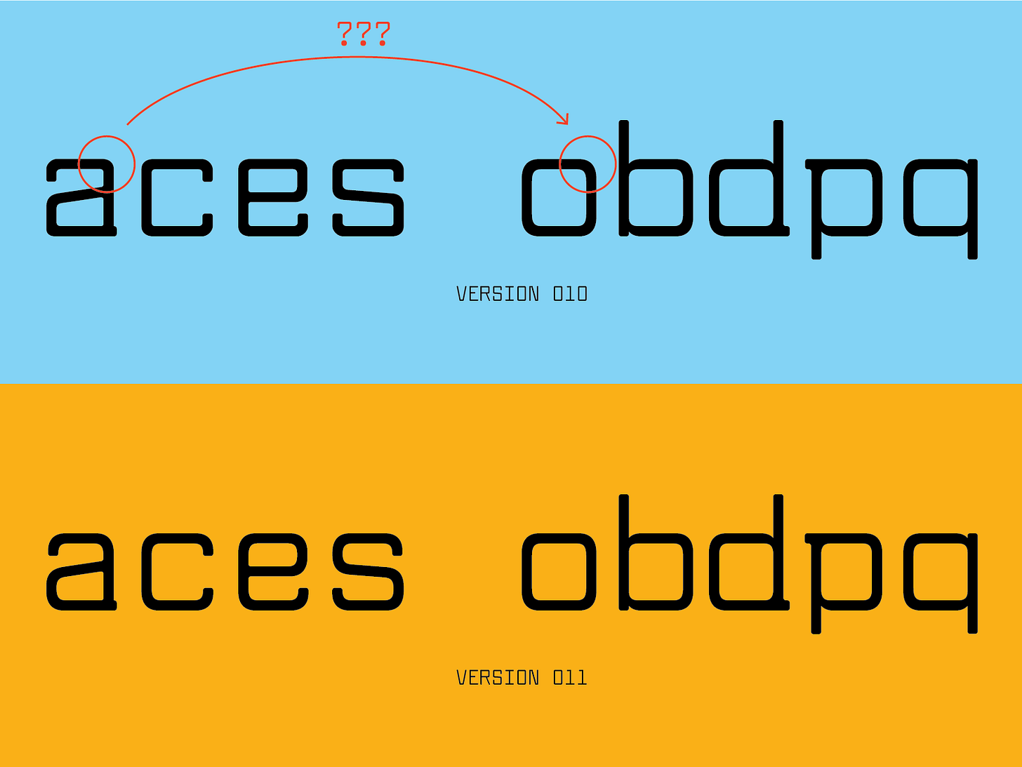
While I was working on the light style, I noticed a discrepancy in the rounds for some of the lowercase letters. Letters a,c,e,s had very square curves while o,b,d,p,q had rounder, smoother curves. I am guessing this happened when I was designing this (within just a few days) during the 52 Fonts project. It’s still a humbling discovery nonetheless. I decided to go in the curvier direction — I like the idea of the lowercase being a little softer around the edges compared to the caps. It probably won’t make a drastic difference when it’s used at text sizes but I would def lose sleep over it!!
I mentioned this in my fave things last week, but I am turning into a hat guy. I love a cheesy trucker hat and now it’s got my brain thinking about custom TDN ones! Or maybe a generic type design one?? I put together this lil mood board of cool/funny/stupid hats and tried out some initial ideas. Alex says that not everyone likes trucker hats and that I should do a more neutral dad hat as well. I love both but probs would wear the trucker style more tbh!! Let me know what you think. I am not feeling super in love with any of these yet but I want it to marinate in my brain for a while!
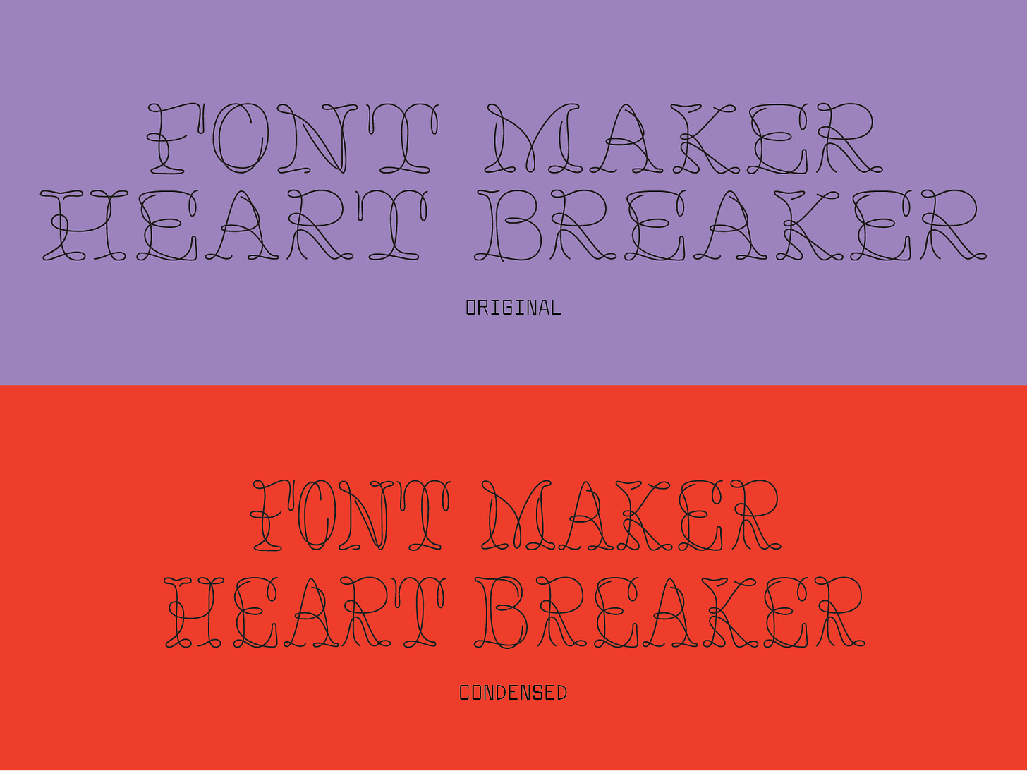
As I was designing these hat prototypes, I really wanted to use Mr Rightside for one but it was way too wide. So of course I had to test out a condensed version. Honestly, it’s so much more usable this way. It’s often said in the type world that condensed fonts sell better and I can 1000% see why!
Lastly, there are still a few spots in my revival class starting next week!! It is a great class for de-mystifying the type design process without the pressure of creating an original concept! If you’re interested, sign up here. <3
5 Things I’m Into This Week
The very underrated and unsexy sport sunscreen stick (55 spf) from Target saved my face from the sun in Mexico!! She’s my ride or die.
I don’t know if any of you, dear readers, give a rat’s ass about fashion but the Jean Paul Gaultier x Simone Rocha show was soooo good!! I am currently scheming ways to sew my own versions. Do you think I could pull off a sailor hat?? Be honest!!
I’ve been watching the show Poldark and it’s a very nice, quiet distraction!! The acting could be better but for some reason, I’m obsessed!
Tuna salad + cheese quesadillas are surprisingly good!! It was the key to surviving getting low on groceries before flying home.
This song that my sister, Luci, shared with me this very morning. It has been added to my club/desk mix!!
Until next week,
Libbie


In my experience working with type, I am more likely to use condensed display fonts because I am using them at larger sizes so it helps to keep the line width short.
As they say in England – "Poldark, and handsome."