Happy Friday friends!
My week was all over the place as usual! Every day this week, I worked on something completely different than the day before. So in typical fashion, here comes a scattered email with fun tidbits!!
I don’t really talk about it much on this newsletter but I do some graphic design freelance work. One of my regular clients is my dear friend and brewery owner extraordinaire, Ryan Verdon. He owns and operates a brewery in Menomonie, WI called Brewery Nønic. Fun fact: Alex and I love it so much that we got married there last August!! Built into an old train depot, it’s truly a beautiful spot and I highly recommend you visit if you’re ever in the area.
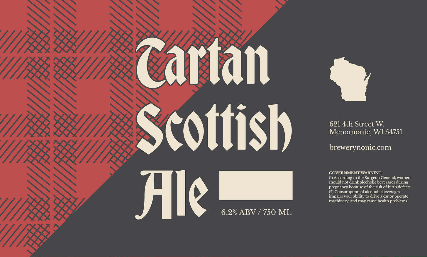
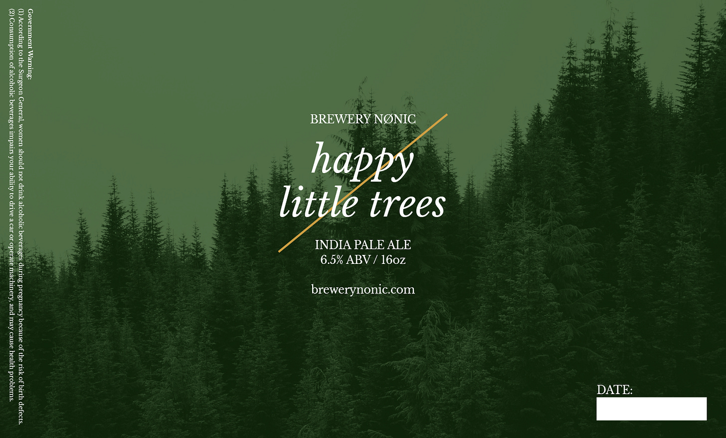
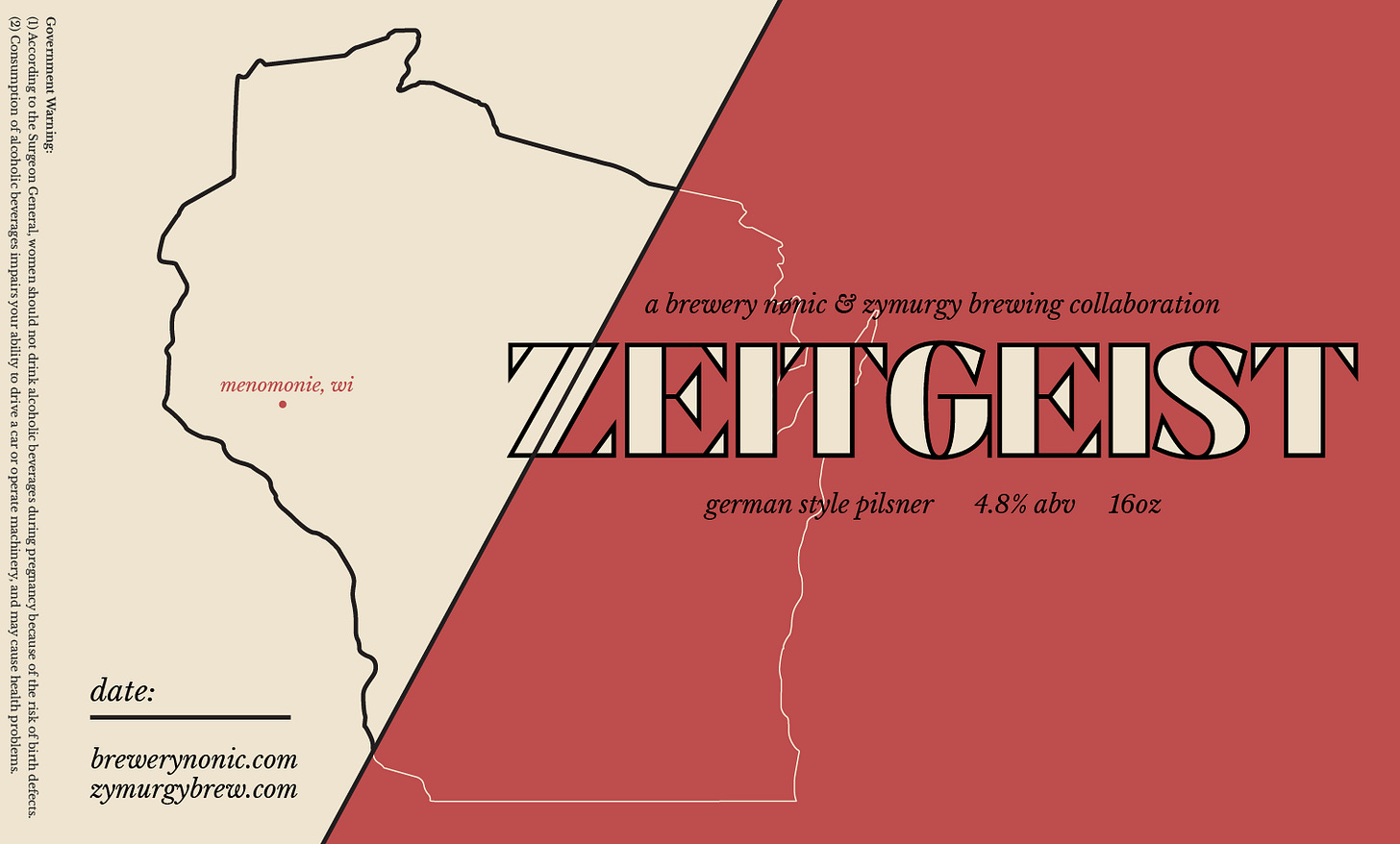
Last week, Ryan asked me to design some new labels for their 16oz cans that they’re launching soon. We are making custom labels for their “always on” beers and I am pretty happy with how they are turning out! Here’s a lil peak at the first drafts/options:
Label 1: Tartan Scottish Ale
We leaned into the tartan/plaid pattern here. There’s a hell of a lot of plaid worn in the state of Wisconsin — especially by burly, beer drinking men. There will be a lot of fun merch opportunities here as well! The main typeface is Bradley by DJR and the text weight is Libre Baskerville by Impallari Type (via Google Fonts). Libre Baskerville is also the primary font for the Brewery Nønic brand.
Label 2: Happy Little Trees
Of course the name is a Bob Ross reference and it’s due to the piney, hoppy flavor of the beer. As a loving ode to Mr. Ross, we decided to try out an ultra minimal option using just an image of what he painted best (trees) and the Libre Baskerville typeface. The Nønic brand is very minimal overall and I think this would look stellar in a fridge full of cans. The slash behind the text is a design device we use occasionally that references the slash through the O in Nønic.
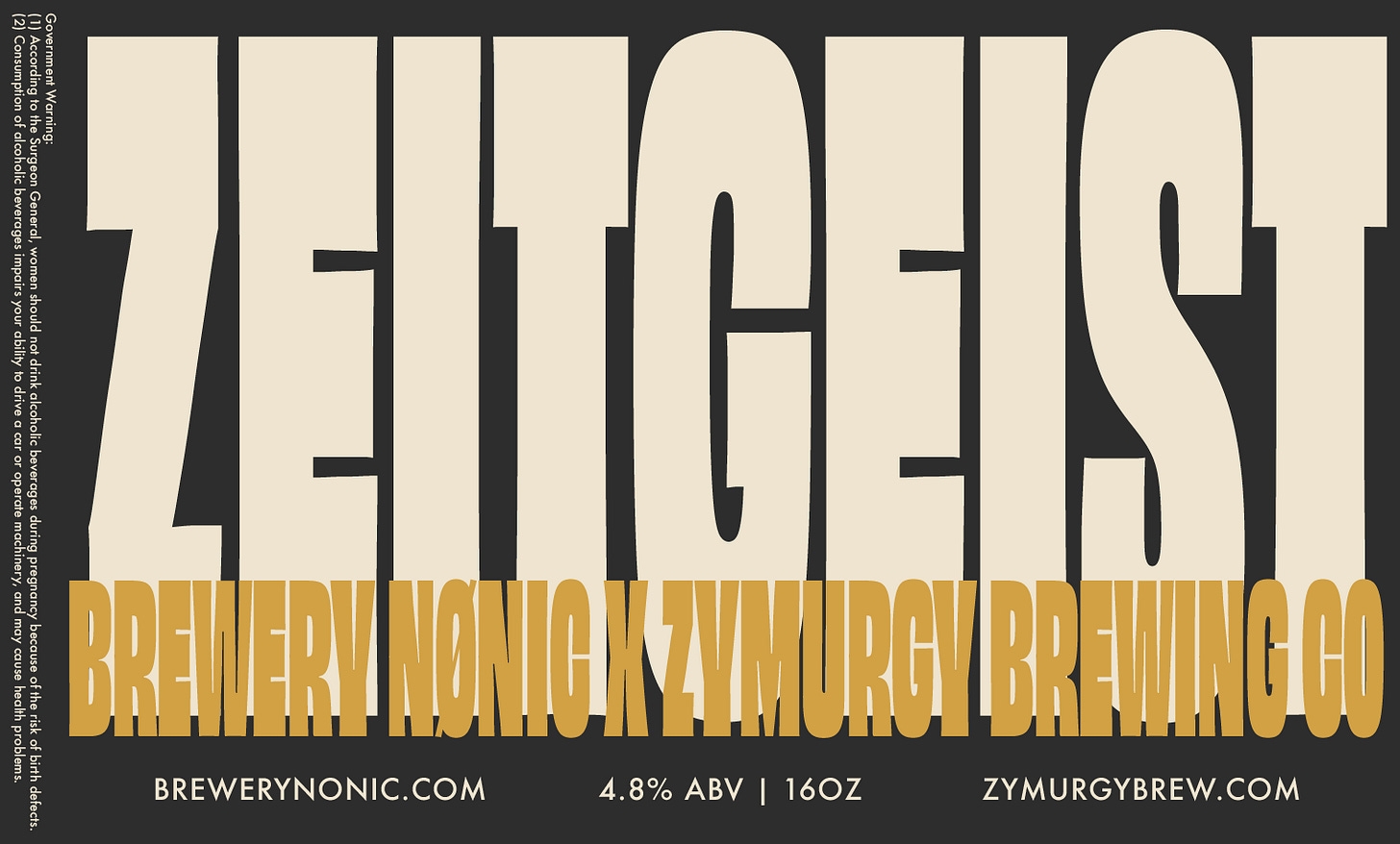
Label 3: Zeitgeist
This is a collaboration beer between Nønic and another local brewery, Zymurgy Brewing. Funnily enough, I made the Zymurgy logo some years back and it was fun to do a branding mashup between the two. Both breweries sell this beer all year round so Ryan asked that the label represent both brands equally. I designed two options for this one.
Option 1: Admittedly this one is leaning a touch more into the Nønic brand than Zymurgy but I think it’s a great first draft! The Zymurgy brand has a Z with a subliminal wheat stalk in it — designed by yours truly as a baby graphic designer. Ryan’s thought was to include the Z with a slash through it as a nod to both brands but I didn’t have a matching font option for the name, Zeitgeist. So in very typical me behavior, I designed a the rest of the required “Zeitgeist” letters in Glyphs. I am pretty happy with it! However, if we do end up going this direction, I am going to touch up that S!!
Option 2: This is a very unbranded option but still punchy and fun. Obviously, I used Obviously Variable by OH no Type Co for this one. I wanted to fill the label space as boldly as possibly and this font had the variable axes to support that. It’s a very loose reference to newspaper or magazine headlines and the phrase “in the zeigeist.” The secondary font is Futura, which is Zymurgy’s primary brand typeface.
Next, I did have a little time to work on the TDN site this week. I have been hesitating to get back into it mostly because it felt very chaotic and unorganized. To remedy this, I made myself a little printed check list to help me work through it. I am going to check things off the list when they are completely done. Most items are 90% complete but require a little finessing and testing. Printed checklists put into plastic sleeves create the best little impromptu white boards. I find it much more satisfying to check this off with a dry erase marker rather than just crossing it off a regular, old to-do list.
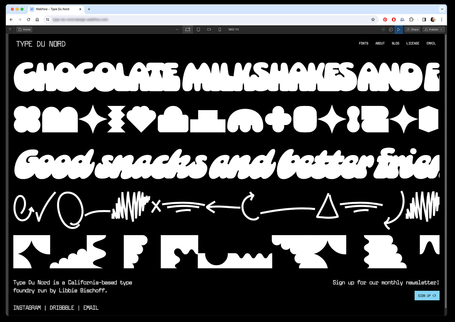
As you can see above, the homepage desktop version is done! Here’s a little preview:
I am so excited to get this done. I am feeling a huge weight lifted by simply getting into it again!!
The final thing I did this week is that I finally ordered some hat samples! It was surprisingly difficult to find the hats I wanted from a company that does small runs/samples. I even added a new option (pictured above) that I thought of right before I was going to submit the order. It’s a very classic novelty hat phrase but the type design version. <3
5 Things I’m Into This Week
I did watch the DaVinci Code and it’s sequel, Angels and Demons, this week! They were surprisingly good! They’re like the scary and suspenseful version of Nation Treasure. I saw them way back when they came out but had no memory of their plots so it was like watching brand new movies!
It’s been super rainy where I live and so I’ve been spending a lot of my free time snuggled up knitting or playing Sims on my iPad!!
This weekend, I am going to start reading (aka listening to) the Crescent City series by Sarah J. Maas. I liked her other series so I’m excited to dig into this one.
The root beer and cola versions of Olli Pops are very good!! I’ve been a little addicted to them lately despite the heart burn that bubbly drinks give me!!
Anyone else have Fast Car playing on a loop in their head since Tracy Chapman played it at the Grammy’s on Sunday?? It’s so good!! Here’s an incredible live version of the song from back in 1988:
Until next week,
Libbie


