This email is one of my longer ones, therefore it may get cut off in your inbox. If that’s the case, there will be a link at the bottom of the email to read the whole thing or you can go to typedunord.substack.com to read it!
Hey buds!
Sorry about the accidental hiatus! I got hit with a major case of type block. I don’t want to complain to y’all about it as I have already annoyed everyone in my life with my melodrama. But I will say that basically it came down to the fact that I’ve been putting a lot of pressure on myself to take this all very seriously this year and honestly it was too much. This is type design! It’s supposed to be fun!!
One of the biggest lessons I learned about myself recently is that the more business-y I try to be about it, the less motivated I am to work on things. It’s not my finest trait but it’s the honest truth. The more fun and engaging my font projects are, the more likely I am to work on it. In short, the less serious I am about this, the more serious I become about it??? And this only seems to apply to my self-initiated work??
Anyways, I have made a little pivot in my plans. I am not going to be working on Weightless next. It requires a lot of tedious tasks and after finishing my site, it is the last thing I want to do. It will be released eventually and it is still near the top of the list. However, I needed to have a little fun and appease my dopamine-deficient, adhd brain.
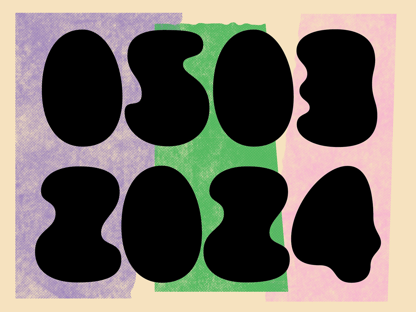
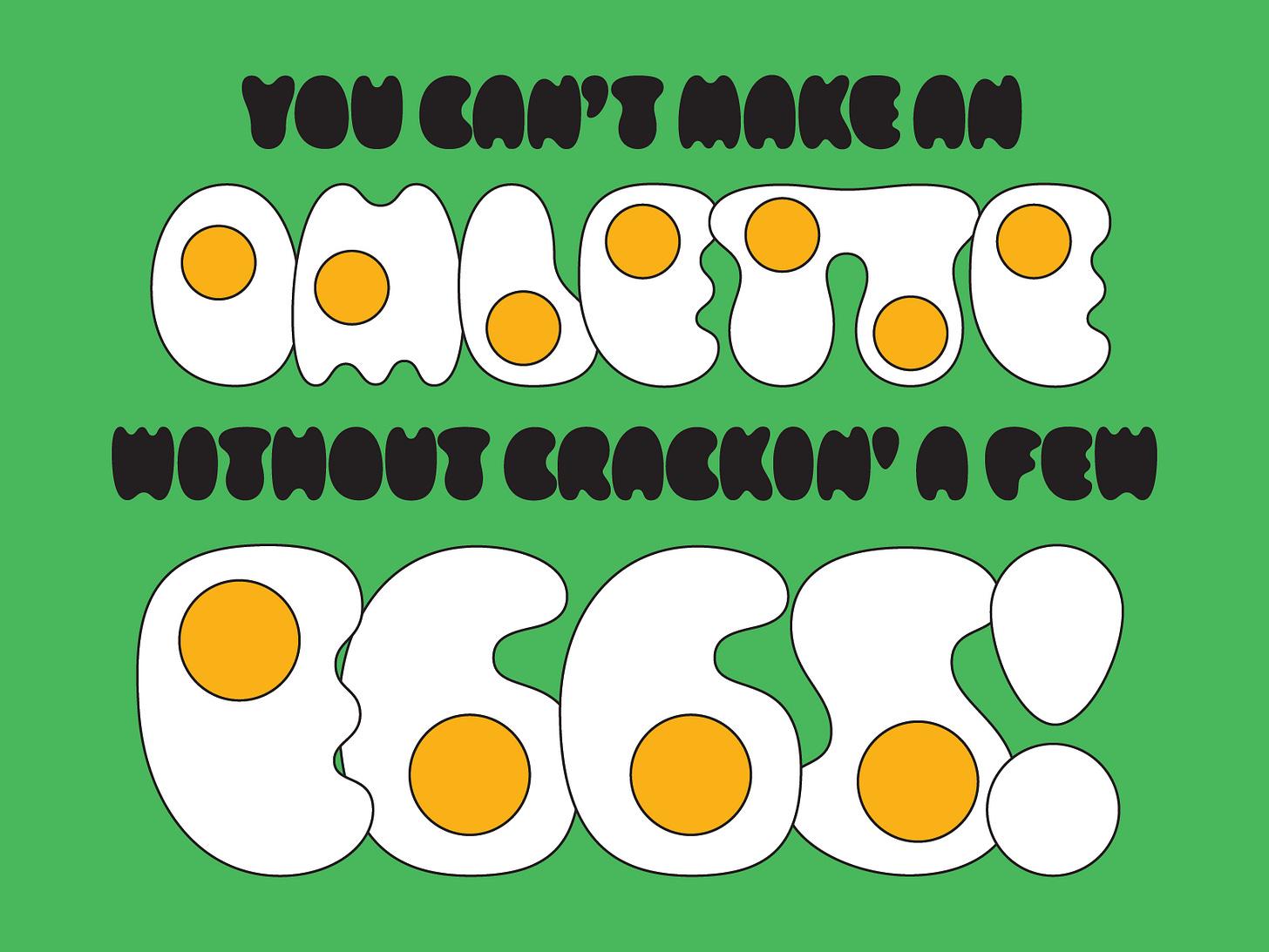
Do you remember egg font? AKA Yolker? Well, it recently became top of mind after seeing a poster(?) someone posted on instagram. I forgot to save it, so please forgive me for not being able to show it and give credit to the creator. But it was basically a b/w image with some text and then at the bottom it said “LAPS” (I think) in a blobby font. At first I thought someone used Socko and I was excited but it was not Socko. However, it looked very similar to Yolker without the yolks! I don’t think they used my font but it was a similar vibe. It looked very hip and prickled my brain a little. It inspired me to pull out Yolker again and see what it looked like without the yolks. Honestly, it’s really sick!! (P.s. - If you know what poster I am referring to, please share in the comments!)
So now I am fully submerged in the Yolker-verse! I feel completely reinvigorated and excited to work on something so fun. Currently, I think there will be the original version, a filled version (just the whites, if you will), a yolk version, and an outline style so they can be stacked and used that way. Personally, I think just the whites is the most intriguing version as it doesn’t have automatic associations. The graphic designer in me is very excited about the logo possibilities!
So far, I have reworked the original alphabet and made it more condensed. It will help make Yolker a little easier to use. It was quite wide before! I have also added numbers and am slowly working through punctuation. Diacritics will come next. I am going to try to get as many languages as possible! It will be a treat to try and make some of them in this style. I love the limitation of it being a specific volume as most eggs contain roughly the same volume of egg. Therefore each character equals roughly 1 egg. And each letter shape is determined by the viscosity of a raw egg!
I am working in the original style as my base because all the other styles will be based off of this one. I might be delusional but I think this whole process will go relatively quickly and I can’t wait to release it. I know more experienced people would think it’s silly to have two blobby fonts (Socko and now Yolker) as my first releases. To me, releasing something is better than being in a stalemate with Glyphs!!
Recently, I dyed a batch of yarn for my local (and fave of all time) yarn shop. In typical fashion, I had to make some super cute labels featuring Socko italic, TDN Dingbats, and Weightless! I love whenever I get the chance to make every part of something. It’s very fulfilling!


Lastly, I have been loosely participating in 36 Days of Type this year. I am using and/or modifying fonts I have already created and including a process vid in each post. If you want to check them out, keep an eye on the TDN instagram!
Friend and extremely talented type designer, Tamara Pilz, is doing a monthly type project right now called Font Fan Club. Her first release is out for one more week and the second one comes out right after that!! Go check it out. <3
I recently watched Conan O’Brien’s new show, Conan Must Go. It’s on Max and I thought it was very funny!
It’s tuna salad sandwich weather where I live (aka warm and sunny). I love to make mine with some chopped pickles in it (among the usual ingredients) and it’s delicious.
Recently I read Emily Wilde’s Encyclopedia of Faeries and it was great! I am almost done with the second book (Map of the Otherlands) and I think I like it even more than the first one!
I recently took up running and have in typical fashion been furiously making playlists to suit any mood I might be in. Here they are:
Jock Rock: A mix of girl punk, hard rock classics, and basically any song that makes you want to head bang while you’re running.
Club 2 10K: A riff on Couch 2 10k featuring the heaviest beats baby!!!
Local Crush: Basically any song that makes you feel like the hottest person in the world and that everyone that sees you instantly has a crush on you. It doesn’t have cool artwork yet but it will soon!
I have a few more in development — an oldies playlist (featuring a lot of 80s music), an indie running playlist, and a playlist with music I would’ve worked out to in high school (Usher, Sean Paul, etc). I’ll share these when they’re done!
Take care of yourself,
Libbie


Yes to prioritising tasks that feel right for you! Thanks for the shout-out.