Hey y’all!
The sun is shining and the breeze is warm here today! It shouldn’t be this warm where I live in March, but the sunshine is getting me high enough on vitamin D not to care!!
Today, I am sending you a random little update! I am still working on Weightless but the work is too mundane to share with you. Because of this, I got bored and picked up an old project to work in tandem with Weightless.
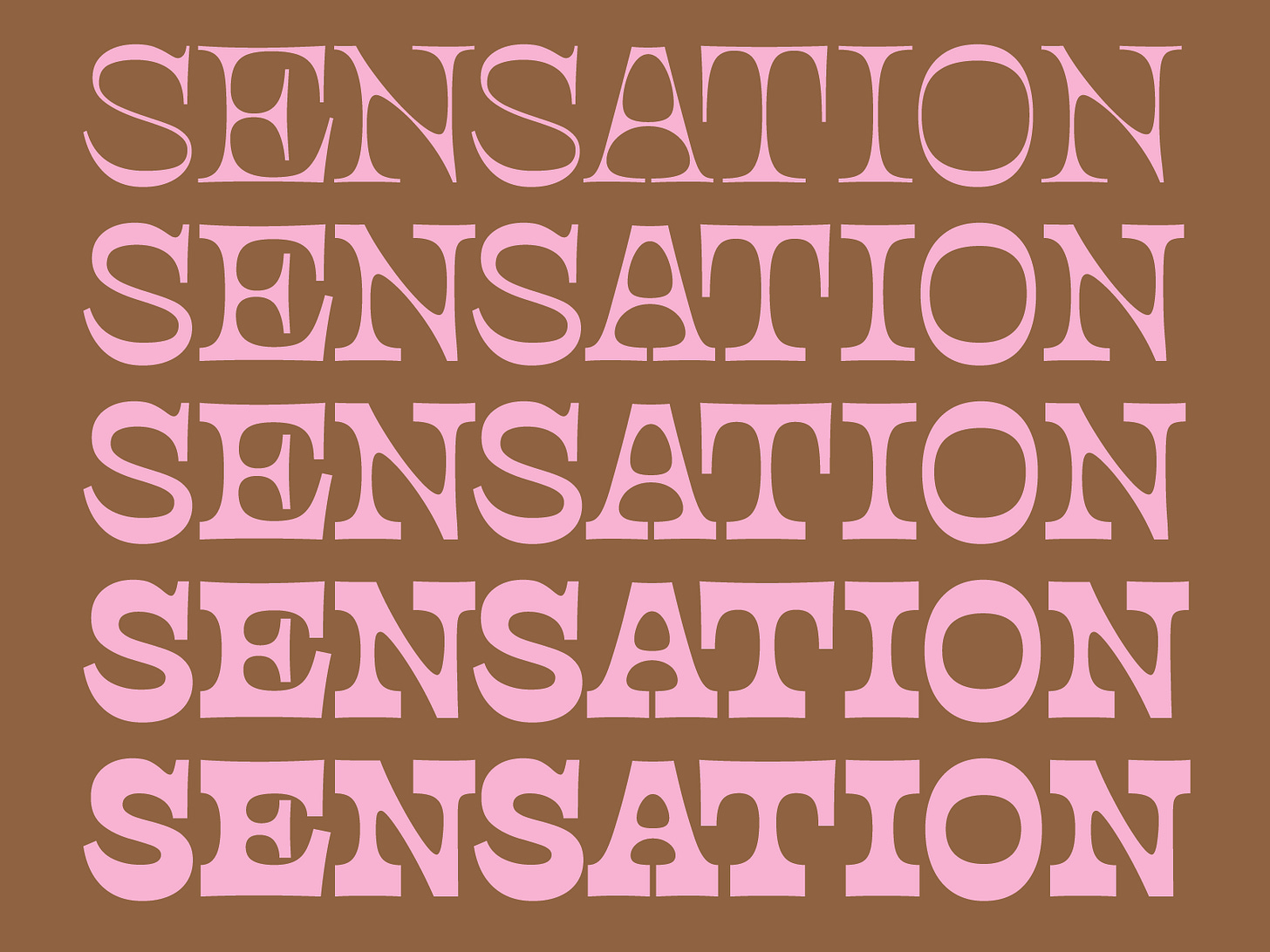
I have been meaning to submit a couple typefaces to Future Fonts that I have sitting on my hard drive. I’ve been procrastinating getting my submission together because the projects I want to submit need a bit of an overhaul before I feel comfortable sending them. One of these typefaces, Cruz Control, is one of my faves but definitely needed the most work! If you remember, I made it a few years ago for the 52 Fonts Project.
It’s a typeface inspired by one of my favorite places I have ever lived — Santa Cruz, California. For me, it’s kooky and eccentric like the general populace of that town. If you’re not familiar, Santa Cruz is a surf town on the coast of California and is allegedly where surfing began on the continental US (it started first in Hawaii). Because of this, it’s a town where lots of surfers in vans hang out along the coast and the vibes are extremely chill. I think Cruz Control has captured the laid back, wacky essence of the place that inspired it!
When I opened the file to look at the state of this typeface, I realized that if I was going to pitch it to Future Fonts, it needed to have clear plan in place. When I originally created it, it had a bold weight and a lighter weight but as masters¹, they didn’t really sit far enough on the two ends of the weight spectrum.
Now, I have updated the files to have the thin master and an extra bold master. Because this font is a display typeface, I don’t think I will need a regular master. The perk of that is less work for me and more styles for you!
As I was looking at the letters, I realized there were a few characters that needed some love. Primarily, the round letters with a vertical serif (like C, and S), letter M was weirdly proportioned, and A had an unnecessary flag serif at the top. The vertical serifs still need some love but I am happier with this solution as it matches the contrast of the typeface overall. The previous version was quite bulky!
Lastly, Cruz Control needs a new name! I would like one that is shorter and more descriptive. I was thinking something like Kook (popular surfing term) but it’s taken! I’d love for it to convey a weirdo, crusty hippy feeling. Picture getting sunburned while having a beer or a joint by the ocean while someone bikes by blasting shitty music over a bluetooth speaker. That’s the vibe!! Please comment or reply to this email if you have any suggestions!
Also don’t judge me if this doesn’t make it onto FF! In that case, I will likely just release it on my own website. <3
¹ Masters in type design are the styles you actually work on in the font making software. So in a lot of cases, you’d start with a thin, regular, and extra bold to cover most of the weight spectrum and then the software can interpolate (auto-generate) between those masters. This saves us a lot of unnecessary work and can expand a type family significantly.
5 Things I’ve Been Into Lately
Alex and I blasted right through both seasons of Silo and it was great! I want to read the books now!
I am recent convert to the Trader Joe’s cult. Lately, when I’m feeling like I want take out, I heat up some of their veggie egg rolls and fry up their gluten free breaded shrimp with some spices, chili crisp, and onions (to capture a similar vibe to salt and chili pepper shrimp). It truly hits the spot and is (hopefully) a little healthier of an option!!
If you’re into sewing, I just recently made the Rue Coat pattern by Spaghetti Western Sewing and it is a great pattern! I made mine out of a wool coating, lined with a thick flannel for a late winter/early spring weather option! I will share pics of it soon but I haven’t put the snaps on yet!!
On a similar note, I finally found white tees a like! I am not much of a shopper as I make and thrift most of my wardrobe but sometimes you just need to buy something new. For some reason, I have never had luck with finding 100% cotton tees that are affordable and not see-through! But these ones from Uniqlo fit the bill quite nicely! Highly recommend!
I made a playlist recently that has sort of a 60’s vibe but almost none of the music is from the 60’s. It’s more of what I think the 60’s should sound like! It’s a good background playlist. I am still adding to it but it’s my fave music vibe at the moment.
In a similar vein, I think ironic indie music is making a comeback — similar to the late 2000’s/early 2010’s indie scene. MJ Lenderman’s jump in popularity has been a good indicator. I just found the band Headache and if you want to go on a wild ride, listen to their music!
Stay weird!
Libbie


Another recommendation for cotton tees – https://kotn.com/products/womens-easy-crew?colour=white&size=xxs
They're 100% medium - heavyweight Egyptian cotton
Rec for your playlist - The Mellons