TGIF y’all!! I can’t believe it’s already week 10!
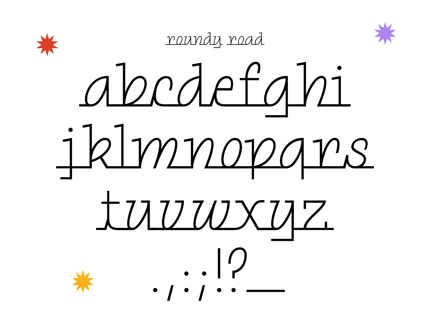
This week, I was inspired by something that’s a little off brand for me — cars! Recently, I saw a font in this style (chrome-type-inspired-flat-baseline-script) on a screen printing shop logo in town. It was definitely not the most modern logo but it reminded me that this kind of font is a thing. I did a little digging and it turns out that this is a pretty popular genre. Just google “car font” and you’ll see what I mean. You can also check out chromeography.com (ran by Stephen Coles) for some fun inspo!
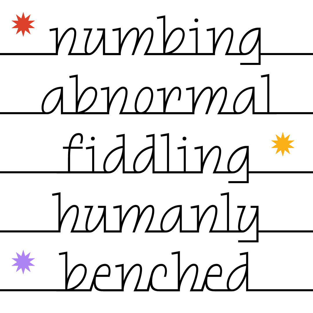
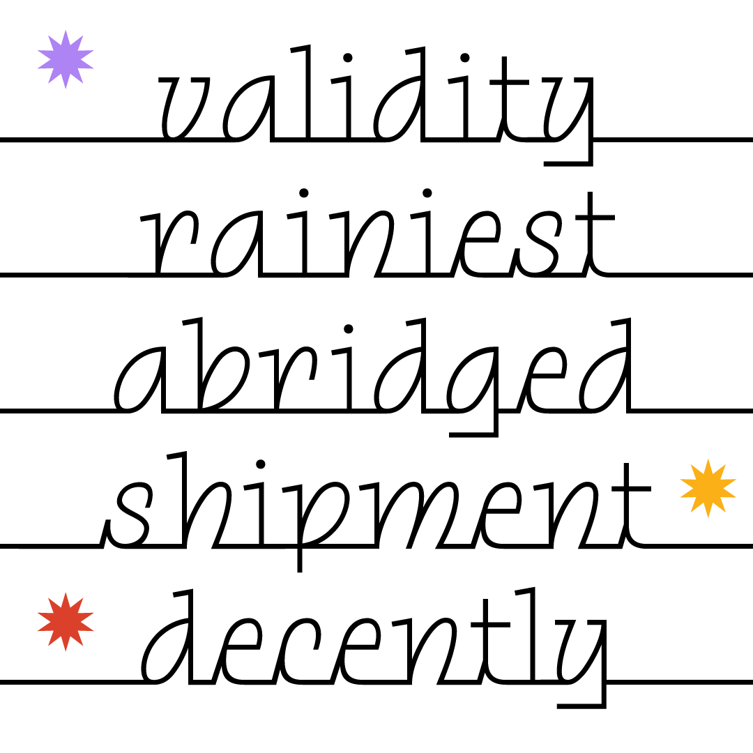
My initial thought was that it could be interesting to approach one of these fonts as an upright italic and borrow a couple things from standard connected scripts. The end result is a very me-version of this style and I’m pretty stoked on how it turned out. I might revisit it in the future and add some caps. Sometimes I struggle with adding caps to such a charismatic lowercase because they tend to be more boring and dilute the whole characterset. However, there might be an opportunity to make some funky caps that utilize lowercase forms in order to preserve some of the italic vibes. 🤔
DOWNLOAD <3
Have an awesome weekend!
Libbie
P.s. — I added an underscore to this set so you can add continuous lines next to the words like I did in the images above!


