Week 11: Rhub
Got rhubarb margs on the brain ;)
Hi hi hi! I’m running out of greetings — can you tell?
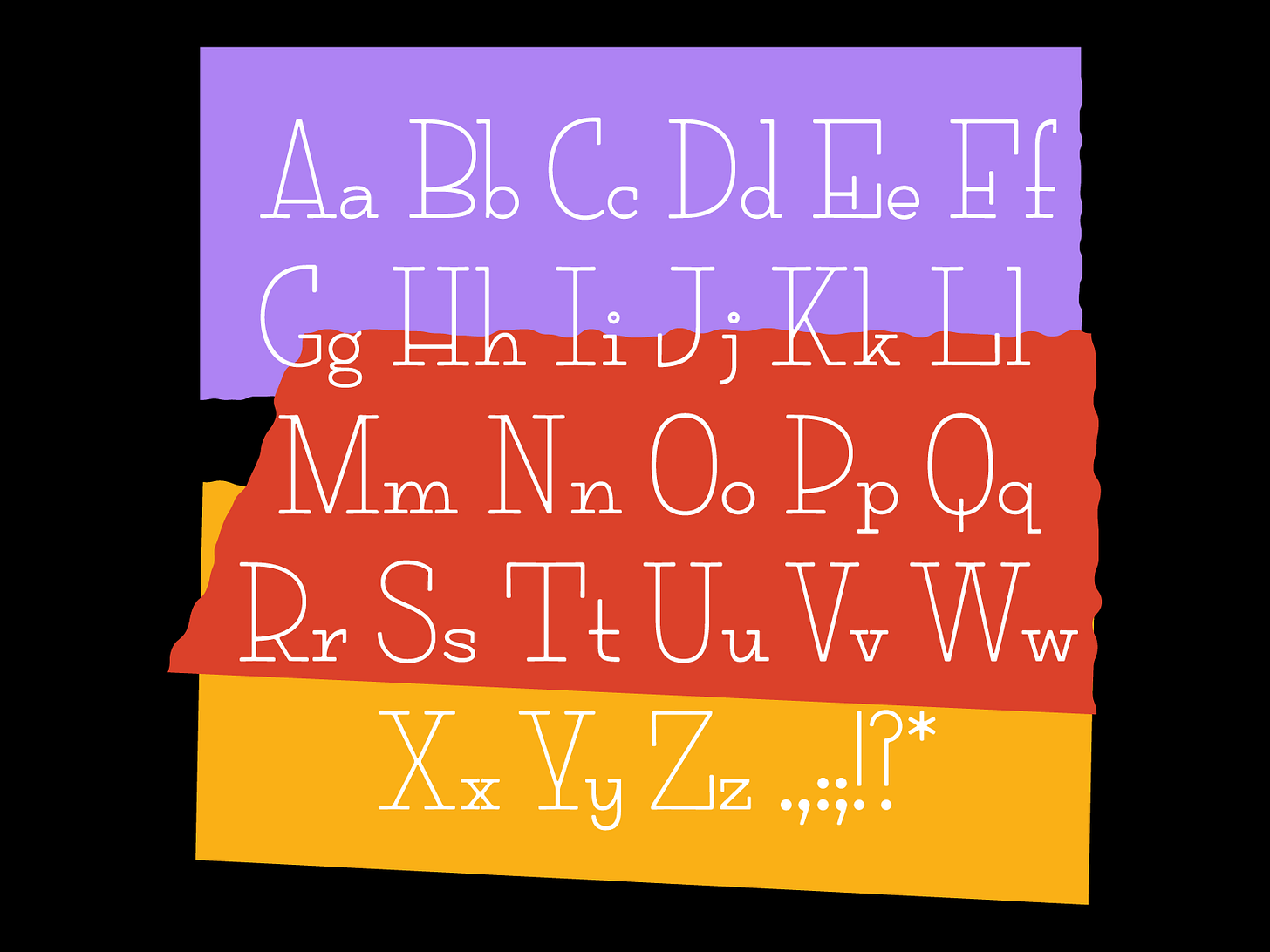
I worked on a lil revival font this week and it is a slightly unexpected style for me! I was wandering around an antique store last weekend, and found this inside the front cover of a book. I must have whizzed right passed it because I have no memory of what the book was or if this was handwritten or printed? I have to assume it’s handwritten due to the year, the shakiness, and the ink bleed. If this is Al’s handwriting, Georgia is a lucky gal.
If you can even believe it, I actually started designing this on Wednesday night (gasp) and finished it on Thursday night (double gasp), so I apologize for any wonkiness. Wonky is the current state of my brain lol. BUT out of desperation, I learned some new things in Glyphs. I really wasn’t stoked on doing another monoline, geometric serif because I feel like I’ve done a couple now and I wanted to reflect the style of the original. Soft with a little bit of bleed. So in order to round out some of the pointy bits, I added a rounded corner filter to the whole thing. It’s pretty easy to add it but it does take some finessing. I had to cut some corners (literally) to add some extra roundness and added a little dip into the serifs so they feel a bit typewriter-y. While I wouldn’t use this filter for a long term project, I found it very efficient for this short term project!

I showed this to a couple friends and the feedback was Peanuts gang vibes meets the Gilmore Girls logo — in a good way of course. I am actually pretty happy with it. I feel like it could be used for some candy packaging or a menu at an Italian restaurant. OR on the inside cover of a book for your lover. <3
XOXO,
Libbie


