It’s Friday!!
Week 13 marks a quarter of the way through this project — can you even believe it? I definitely can’t. It still feels like week 4 to me lol.
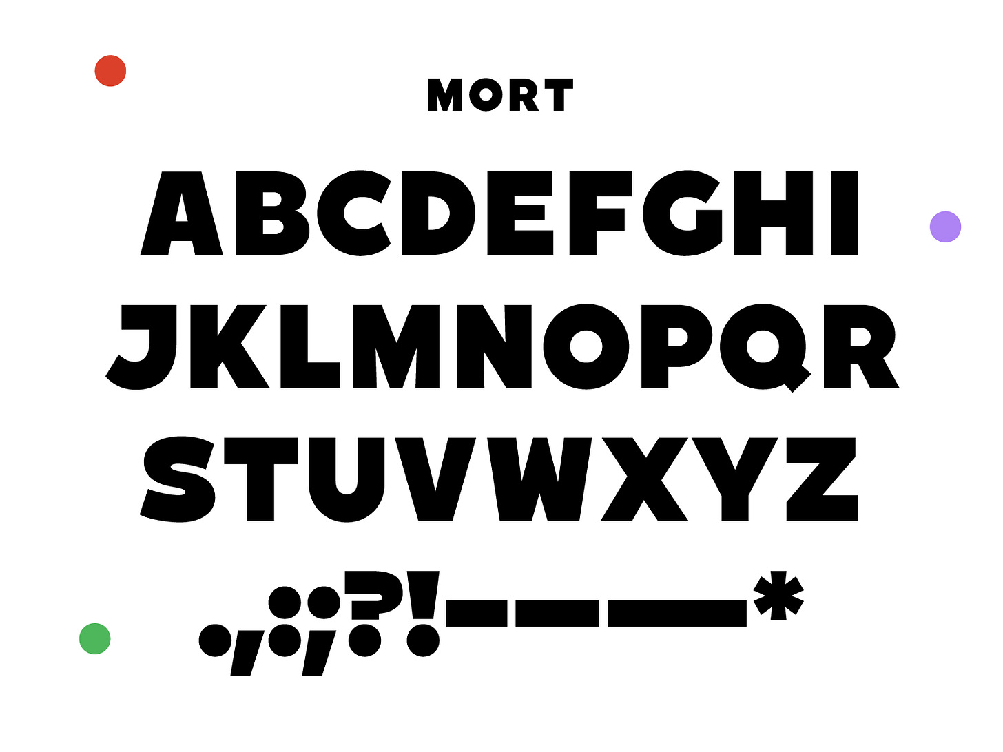
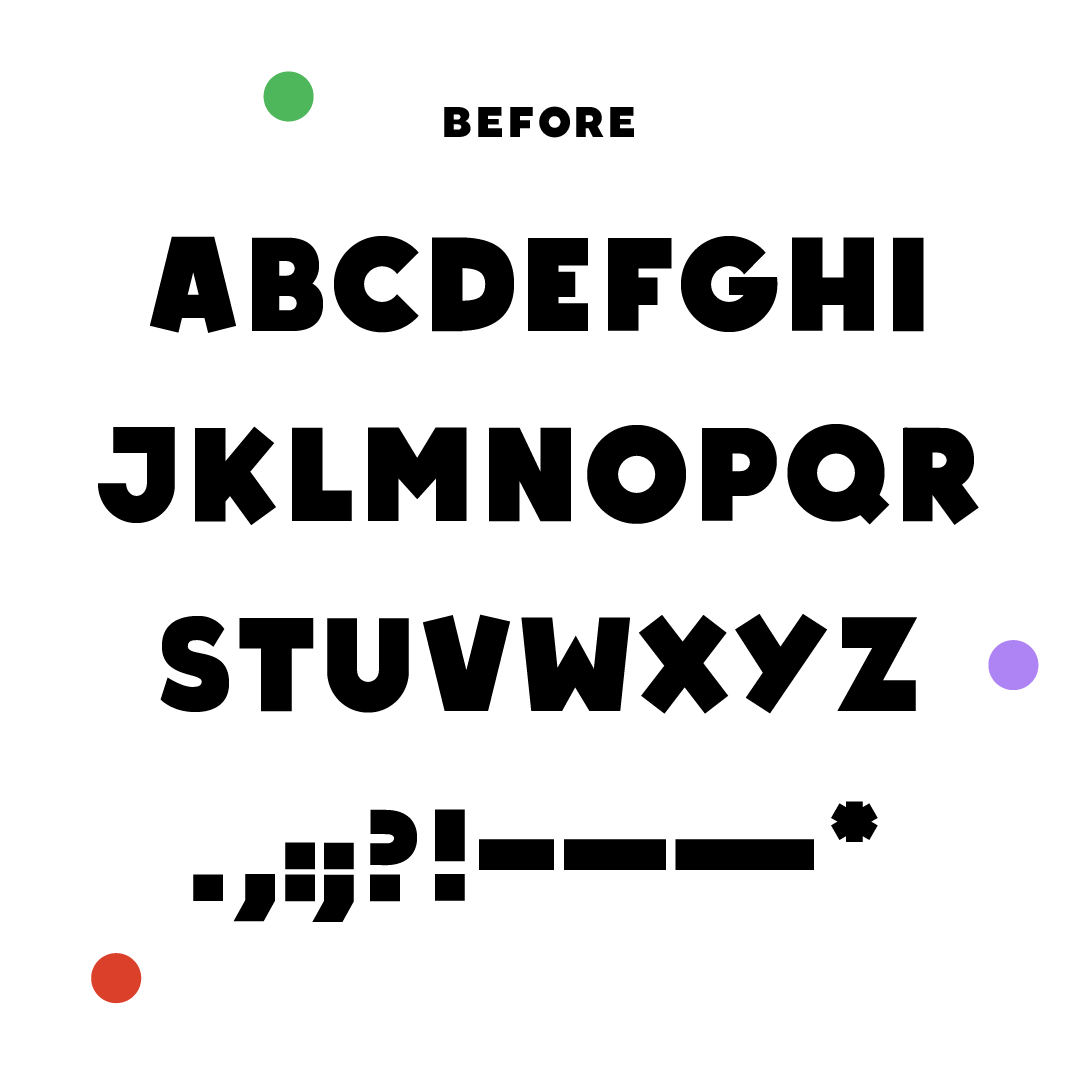
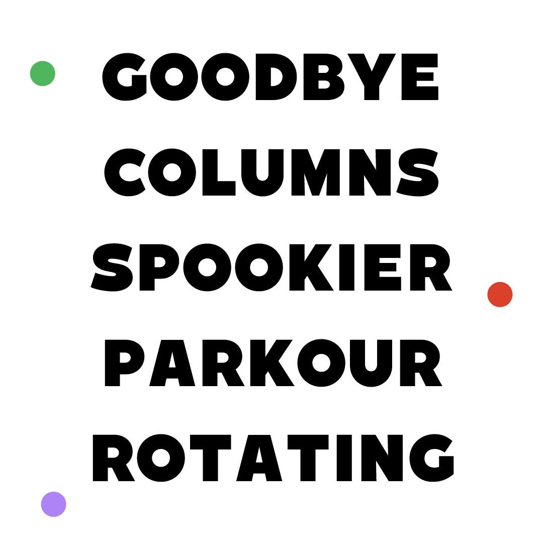
I’m visiting my family this week (finally!!) so I’m going to keep this short and sweet! I brought back an ol’ TDN classic this week. This is the second font I ever made. Of course, I made some adjustments based off what I’ve learned since designing it. Mostly just optical and weight adjustments. But I tried to keep the same vibes as the original. It was interesting to look back on my decisions from 2016 with fresh eyes.
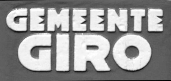
The original is based off this lettering I saw in Amsterdam and I really liked the chunky sans! Since then, it’s moved away from the original quite a bit. I traded the E for a more traditional form and I made the letter widths more uniform. I also rounded the G to make it a little more like the O. My original interpretation of it had a really awful S so I made a nicer S for this release. I would really like to come back to this in the future and make some thinner weights! Maybe for week 26???
Lastly, I just wanted to thank y’all for the support over the last 13 weeks! It’s really amazing to be able to share my work in this way. I love having you all along for the ride!! <3 <3 <3
Have a great weekend!!
Libbie


