Hey y’all!
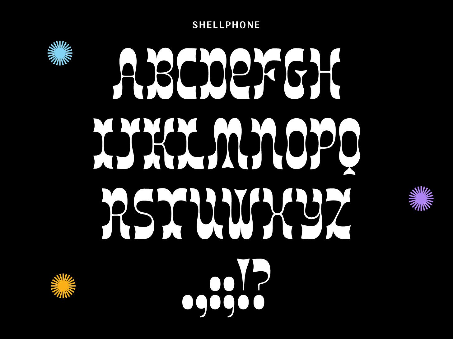
That scene in Zoolander where Derek is hanging with his Pops and his mermaid commercial comes on has been stuck in my head ever since Tommi Sharp (Taters queen) told me that this design looks very mermaid-y.
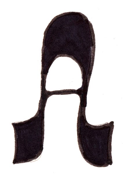
Over the weekend, I decided to do a bunch of type drawings to help me work ahead a bit for the coming weeks. For me, it’s really helpful to get a bunch of brushes, pens, and markers out and bulk ideate for a couple hours. I always try to use weird pen angles, draw with things I don’t feel comfortable with, and keep it really loose. It’s truly the most fun thing to do!
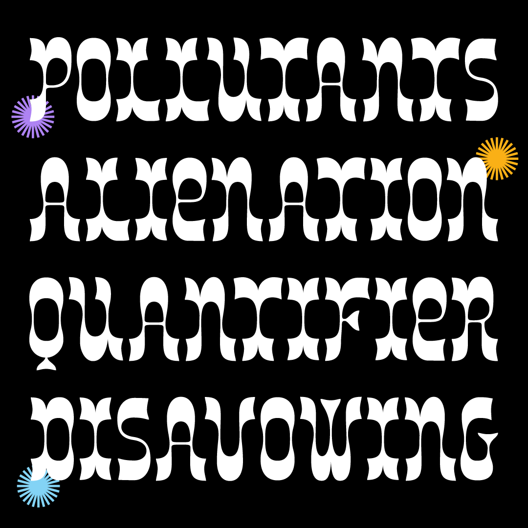
This design came from one of my “A” sketches (sometimes I focus on one letter for a whole page). I started to sketch what the other letters would look like and got really excited about this concept. I try to ride the excitement of a design when it comes. It went very smoothly with most letters except the Q and S. They still don’t feel quite right but alas, it’s Friday!! I also really didn’t want to go for the scalloped serif/western vibe as it’s been done a lot. I feel like I avoided it for the most part but some letters (like Z) had to go that direction to feel successful.
Anyways, I had lots of fun making something really curvy and high contrast this week! I feel like I’ve been living in a monoline world for a bit! <3
See ya next week!
Libbie


