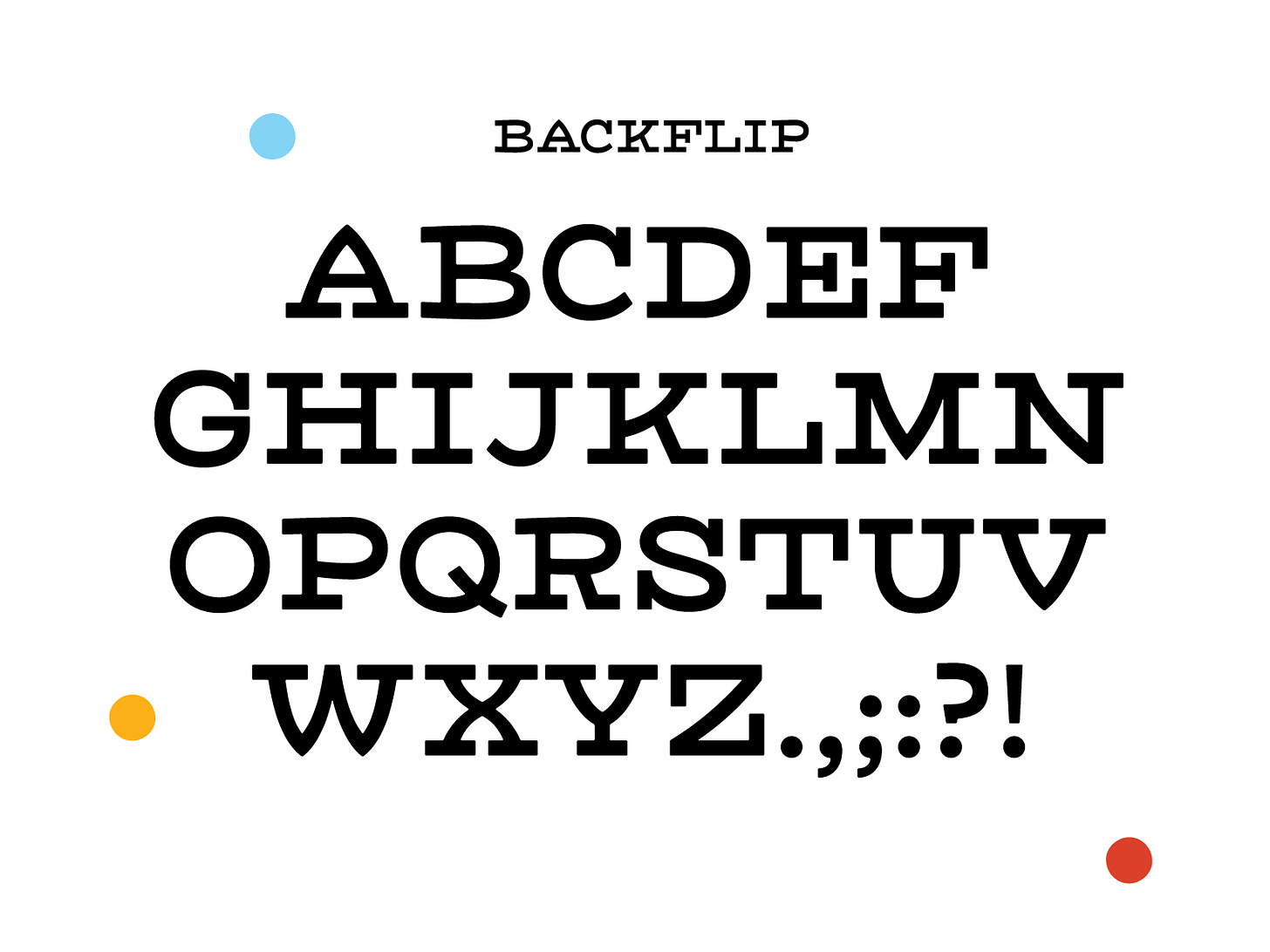
Salutations friends!
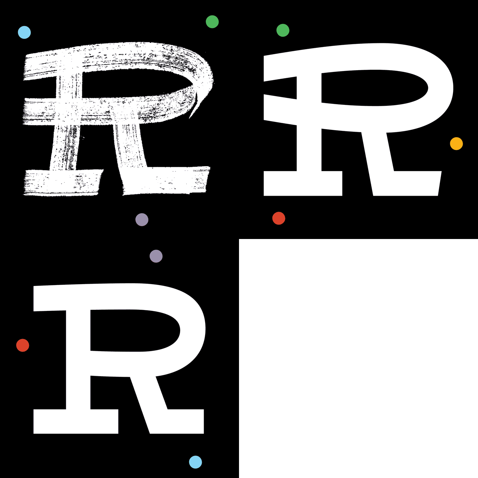
Have I ever mentioned that R is my favorite letter? It has something to do with the drama of the leg and bowl. I love drawing it. I love solving it. This week’s font started with an R. I drew a fun brushy one a couple weeks ago that I was stoked about. However, the font kind of evolved into something different and the R was a darling that needed to be killed in the end.
My intention this week was to draw something that felt classic but a little more expressive than a traditional slab. That’s the idea that came from the original R sketch. I liked the curved brush strokes that made up the bowl. Though they’re a lot harder to pull off in a functional font. When a font this wide has a curve at the top (in place of a flat part), you have to overshoot a lot to make it feel normal but then you end up with a moving target for a cap height. Then you begin the process of straightening things out until you only have hints of curves but enough to feel expressive.
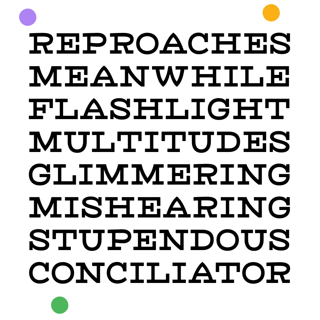
Anyways, I see this working for anything that requires an oversized and overly friendly slab! Like a gig poster or a beer label. <3
Have the chillest weekend!
Libbie


I do Love this font, my only regret in life is not finding this blog sooner