TGIF y’all —
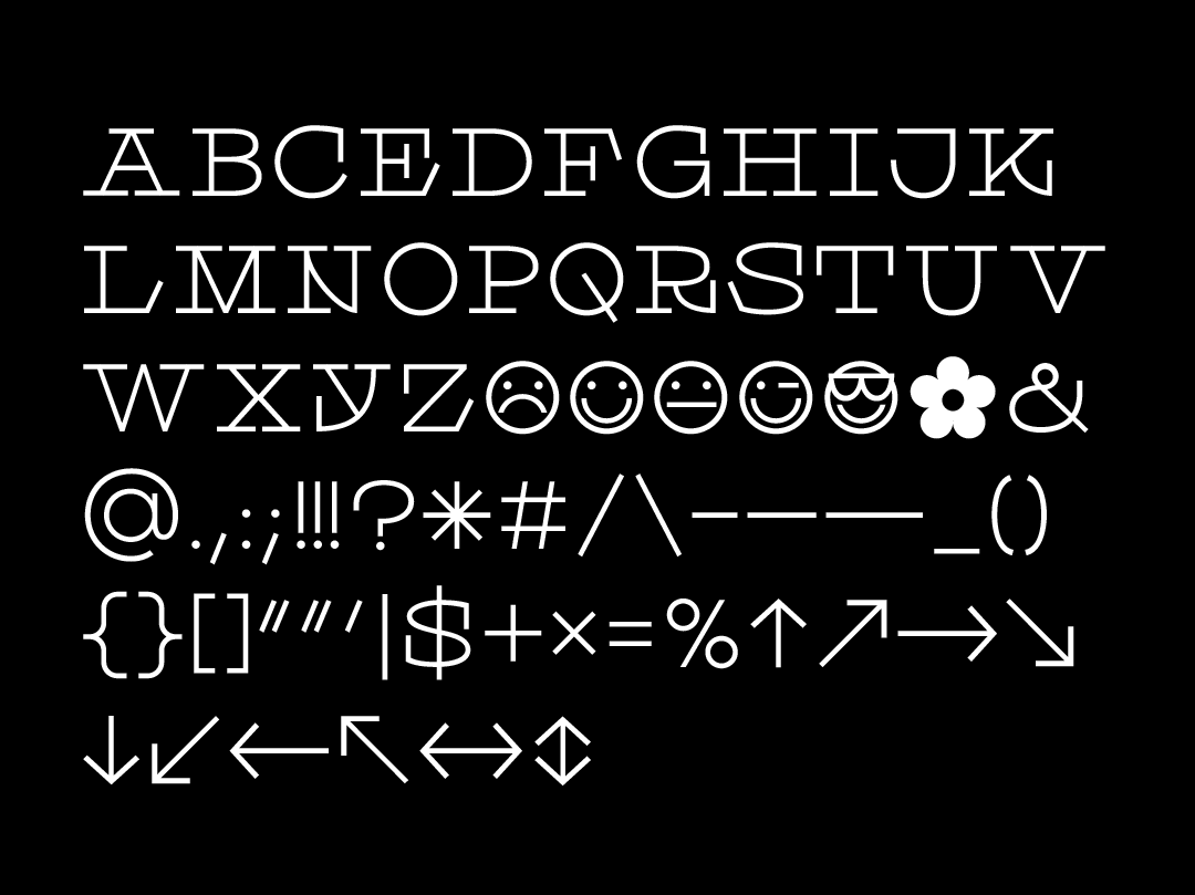
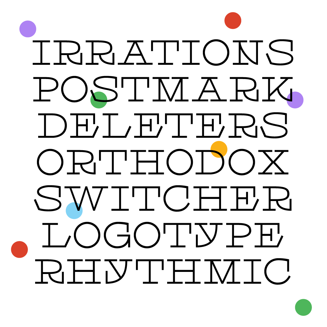
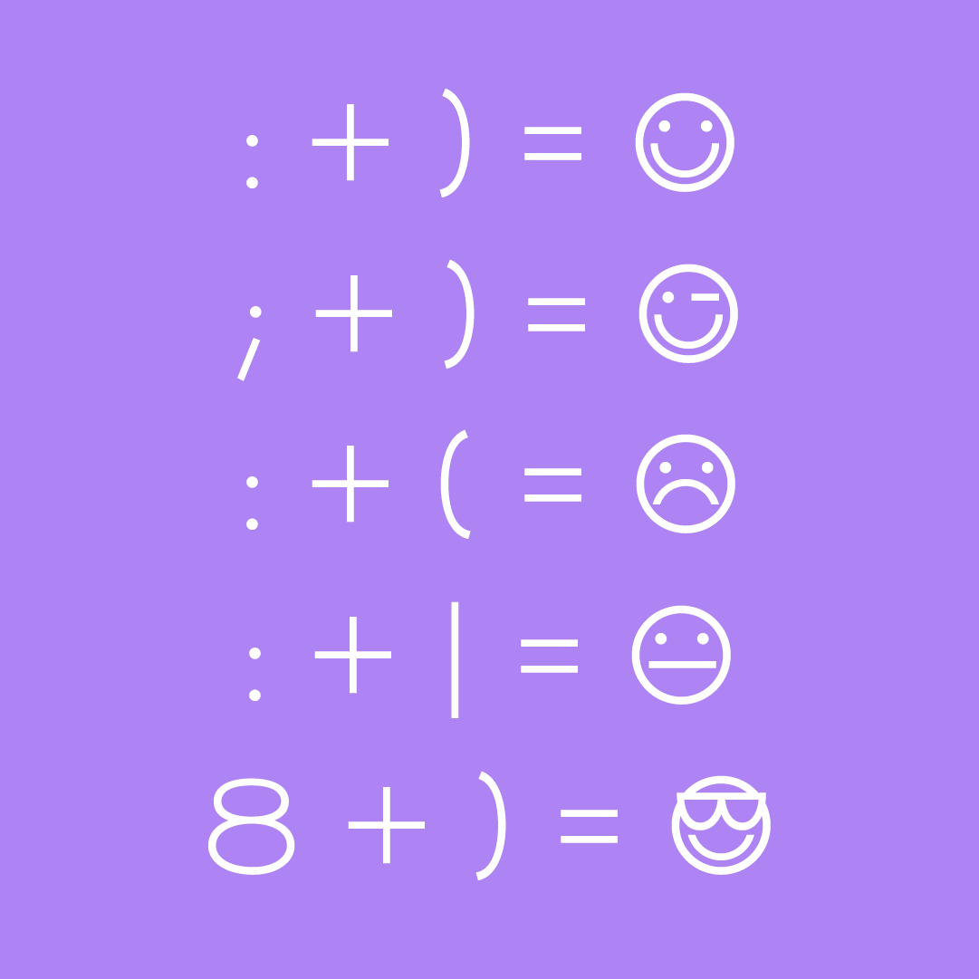
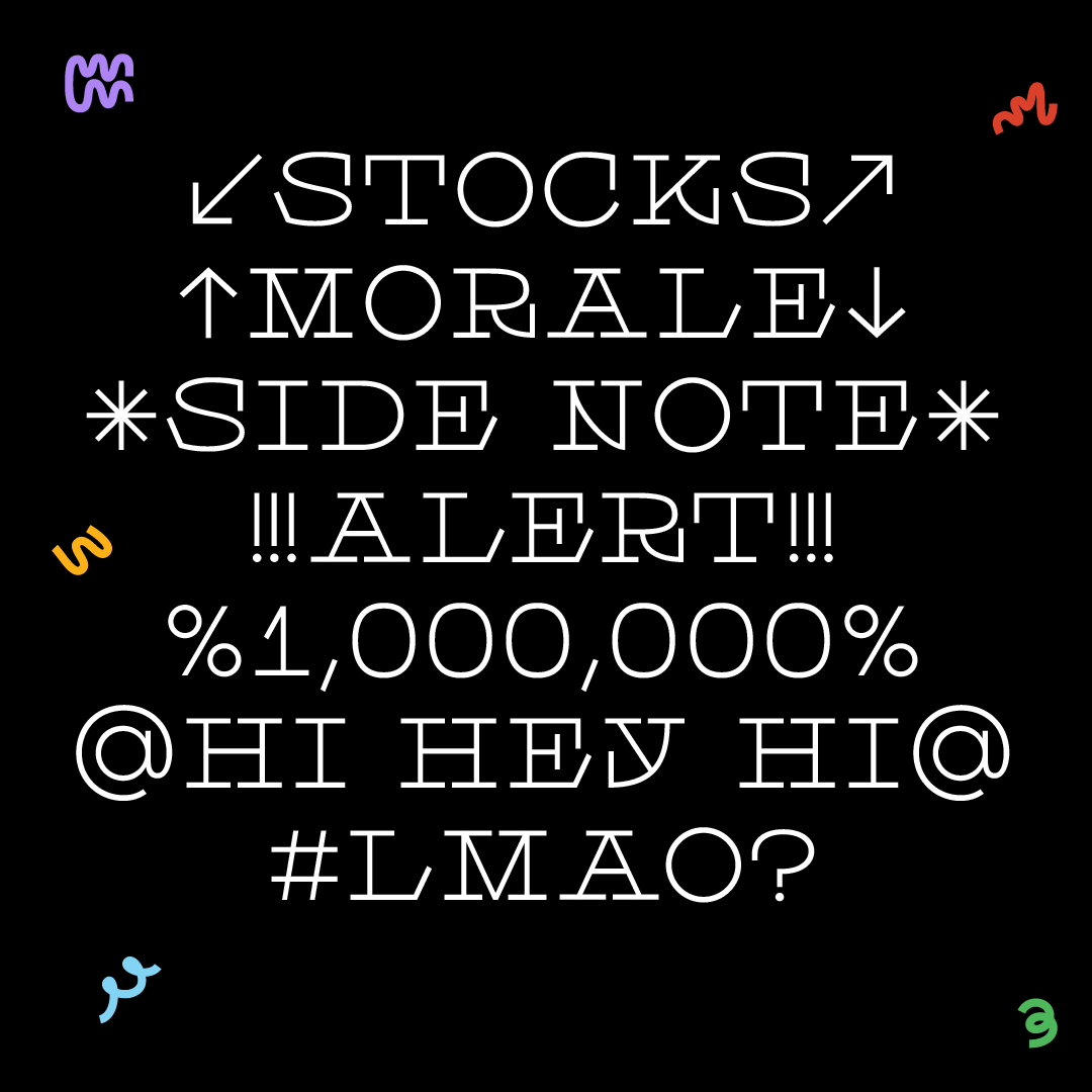
Here it is: Scraps! It’s a mono-weight slab with dramatic serifs and simple forms. It has a full set of caps, numbers, and some playful punctuation. There are even some fun smiley face ligatures programmed into it. Open up the glyphs palette and check it out!
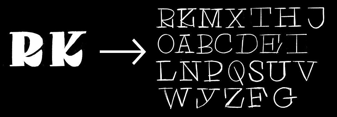
Scraps was very, very fun to work on. It was easy enough where I could cruise through it but weird enough to still be fun. After last week, I was feeling a little rusty and I wasn’t sure what I was going to make next. I started sketching some ideas and I was trying to get this super heavy serif style to work (see rough drawings below). Then I decided to draw the skeleton (which usually helps to clarify things) and the skeleton felt cooler than my original sketch!! Then of course, I moved right into Glyphs and was in a type design induced trance for the rest of the day.
I broke a lot of “rules” this week. I made some choices that were pretty cool to me but that a more advanced type designer might frown upon. The punctuation is pretty large and dramatic, there are automatic smiley face ligatures, the Y is weird for seemingly no reason, and the exclamation mark has three exclamations (!!!) for the price of one. Scraps is for all my fellow exclamation point over-users. I made the asterisk as big as the caps so you can use it for *decoration* and I added a flower symbol as well. Have fun messing around with this one! And always, always tag me in/send me things you make with it! You’ll probably make me cry (in a good way).
Have a good weekend!!!
Libbie
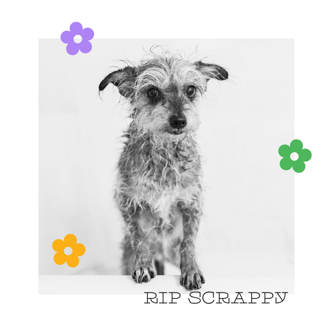
P.s. — I named this font after my dear friend Jeremy’s dog, Scrappy. He passed away on Sunday and he was a true gem. We’ll miss you buddy <3


LOL when you get the alphabet wrong :(
Is this font still available =P?
Awesome content btw!