Hey y’all!
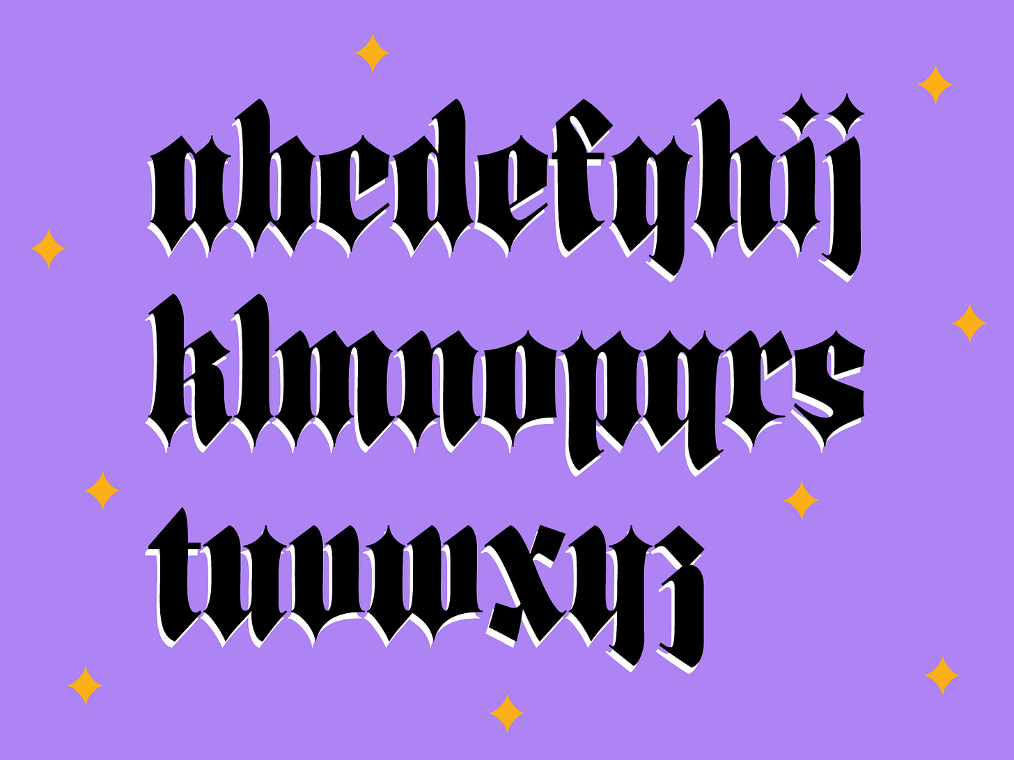
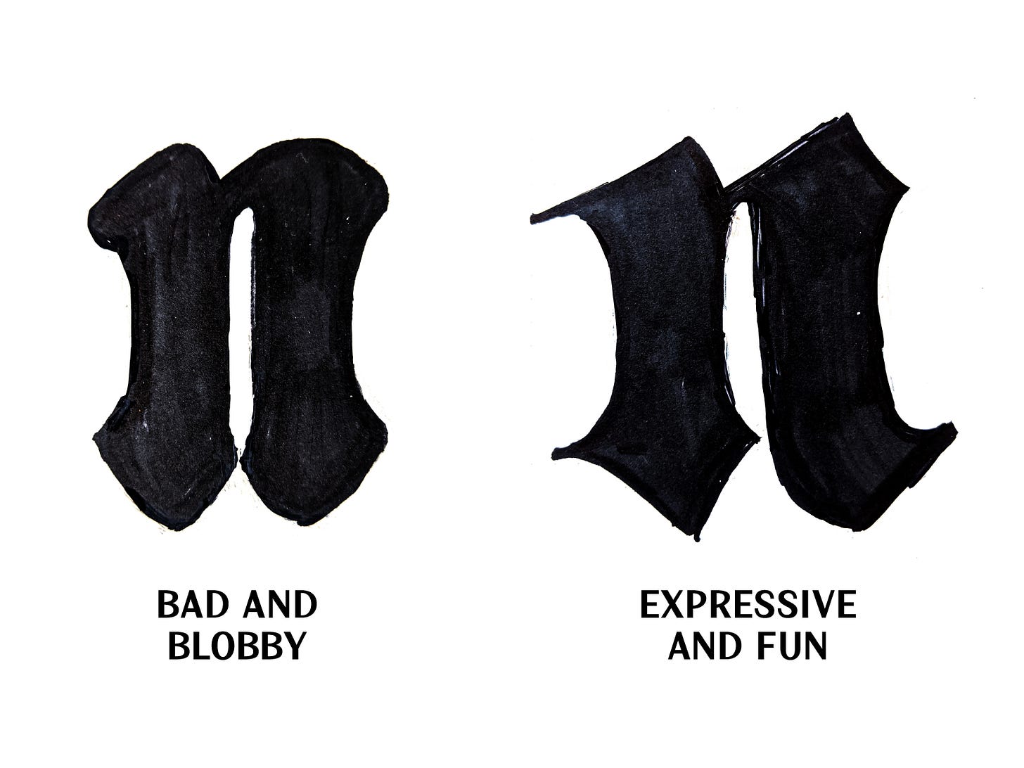
I worked on a blackletter this week! Can you even believe it? It’s well out of my comfort zone but I made it!! The whole idea started as a “blobby blackletter” but the blobby versions were unsuccessful. I changed my approach to a “less rigid Fraktur.”
At first, I was going to create a soft and friendly blackletter, but the softness made it feel like something else entirely. Then I shifted to creating something more expressive. Like if you made a blackletter with a flat brush and then added pointy bits on the bottom.
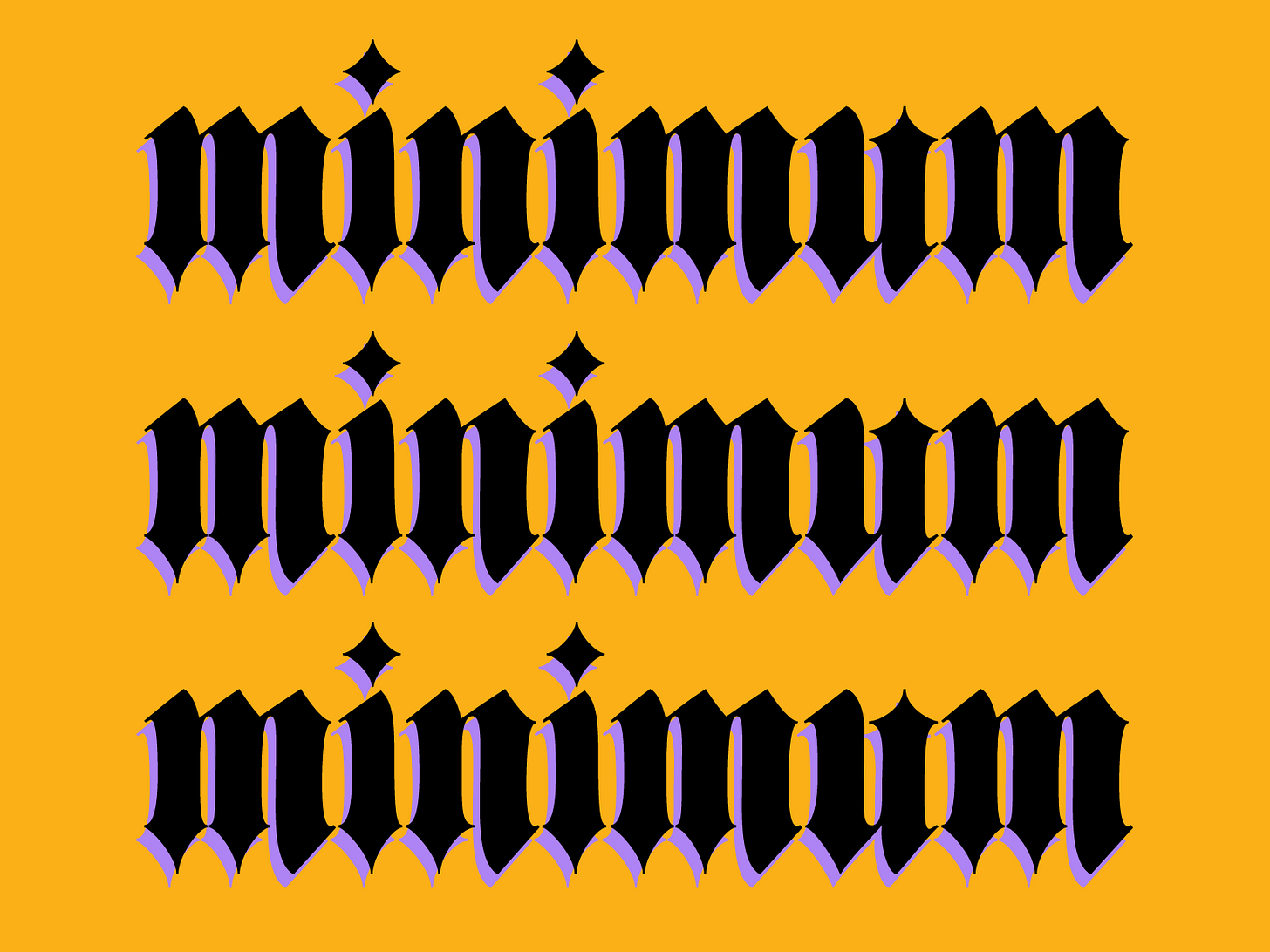
One of the hardest things about blackletter is getting the rhythm of the letters to be consistent. This means that the internal (the space inside the letter [counters, etc]) and external space (the space around the letter) to be visually the same. Having consistent spacing is important for any type design work but it is especially crucial for blackletter. There are a handful of letters that are really tricky to get right with this pen angle. Round shapes like o, e, and c still feel a little small/too open. And rule breaking letters like s, x, and z involved a lot of wrestling only to still feel incomplete. In the end, I am 82% happy with how this turned out. I hate the s and x, but what can you do?? Although, I am already scheming on what the caps + a variable version (with a weight axis) would look like. TBD!
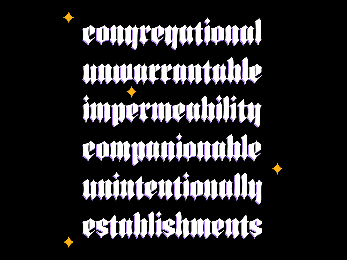
Anyways, here’s Buffy. An expressive blackletter — just in time for fall! I am picturing this on a tea label, some indie cleaning product packaging, or just on a halloween party invite. If you use it for a party invite, you need to invite me. Thems the rules. Well, thanks for being here! See you next week!!
5 Thing I’m Into This Week:
I know I’m like 3 years behind but I’m obsessed with matcha lattes!! My friend Kim let me try her’s recently and it was sooooo goood. Of course I immediately bought all the stuff to make it at home. Highly recommend.
Happy to report that OmniFocus is the organizational program for me. I feel like one of those ultra-organized people already!!
Recent Future Fonts release, Kadabra, by Victoria Rushton. It was started by her late partner, Dai Foldes. Such a beautiful script! Victoria gave a talk at the 2016 Typographics conference that is so helpful if you want to learn about connected scripts!
Randomly into Drake’s new album, Certified Lover Boy.
Am I crazy or are there a bunch of new (probs just new to me) type design podcasts? If you know of any that aren’t listed below, send them my way!! Here are the ones I know about:
The Interrogang Podcast (same crew that puts together the Proof&Co newsletter that I shared a week or two ago)
Letter Now by Martina Flor
Creative Characters by Monotype (sorry)
TTYL,
Libbie


