Hey hey hey!
We reached the halfway point! Woooo! What a trip it’s been. This week was probably my favorite yet. So many of you participated in picking my typecooker last week and it was really exciting to make this more of a collaborative effort! I will be doing more things like this in the future.
Last week, I asked for help in developing a typecooker recipe for the halfway point of this project! Here is what the final was:
Weight: Light
Stroke endings: Serif
Contrast model: Translation
Width: Wide
Curve ball: Drawn upside down or with non-dominant hand, allergic to gravity, and bungee cord
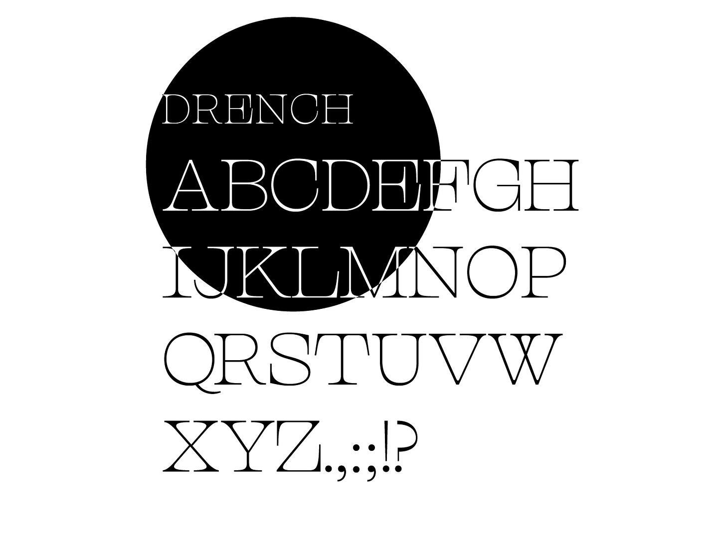
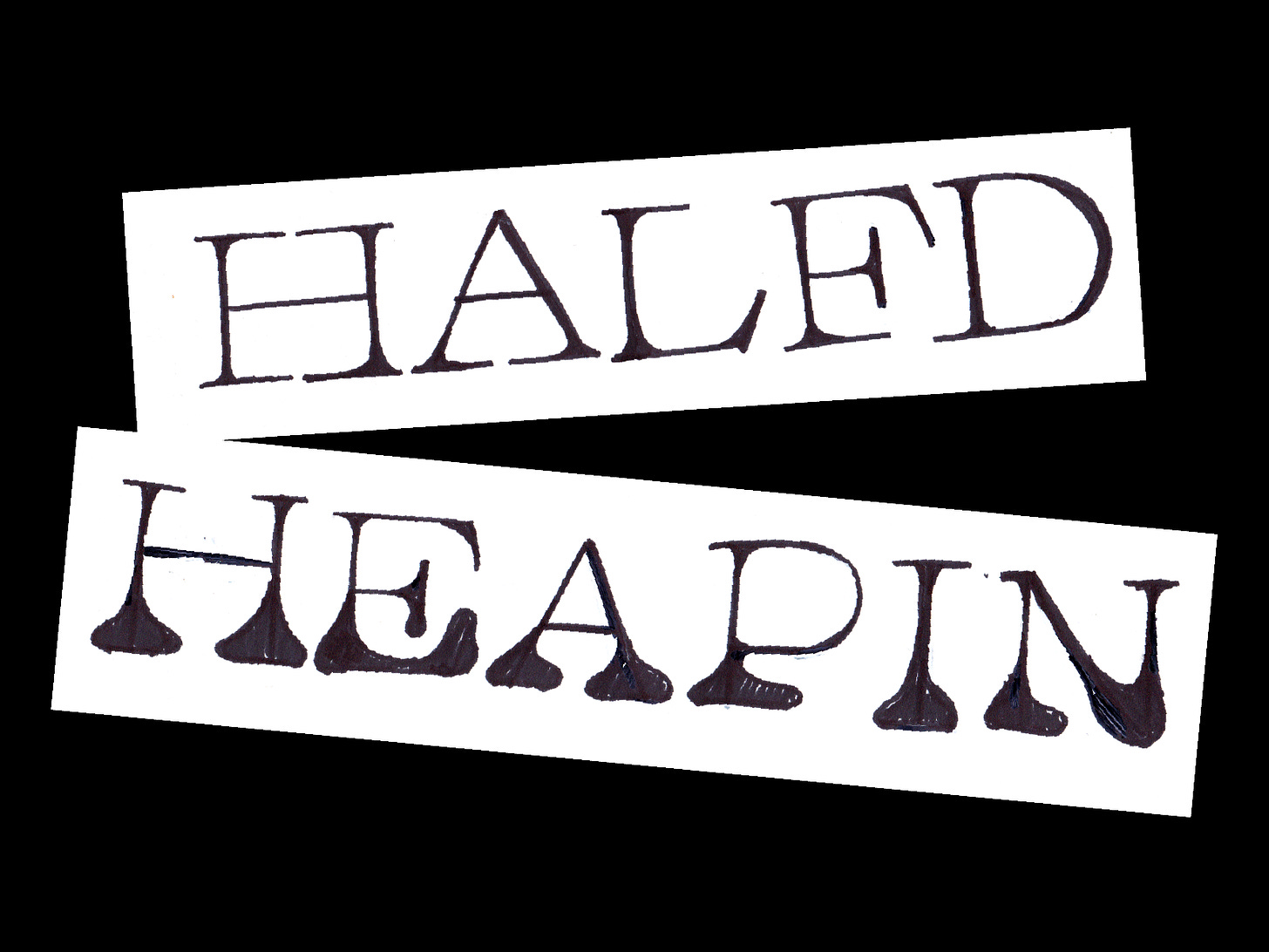
On Monday, I sketched some of the curve ball submissions and had some interesting results! I drew left-handed, explored the bungee idea, made a drawing that was “allergic to gravity”, and drew upside down. I had y’all vote between my faves: allergic to gravity and extra long serifs (the result of drawing upside down). The vote teetered back and forth but in the end, long serifs won! Adding the long serifs in was a really interesting experience. It created some weight to pool in the serifs and I actually liked the vibe so I kept it!
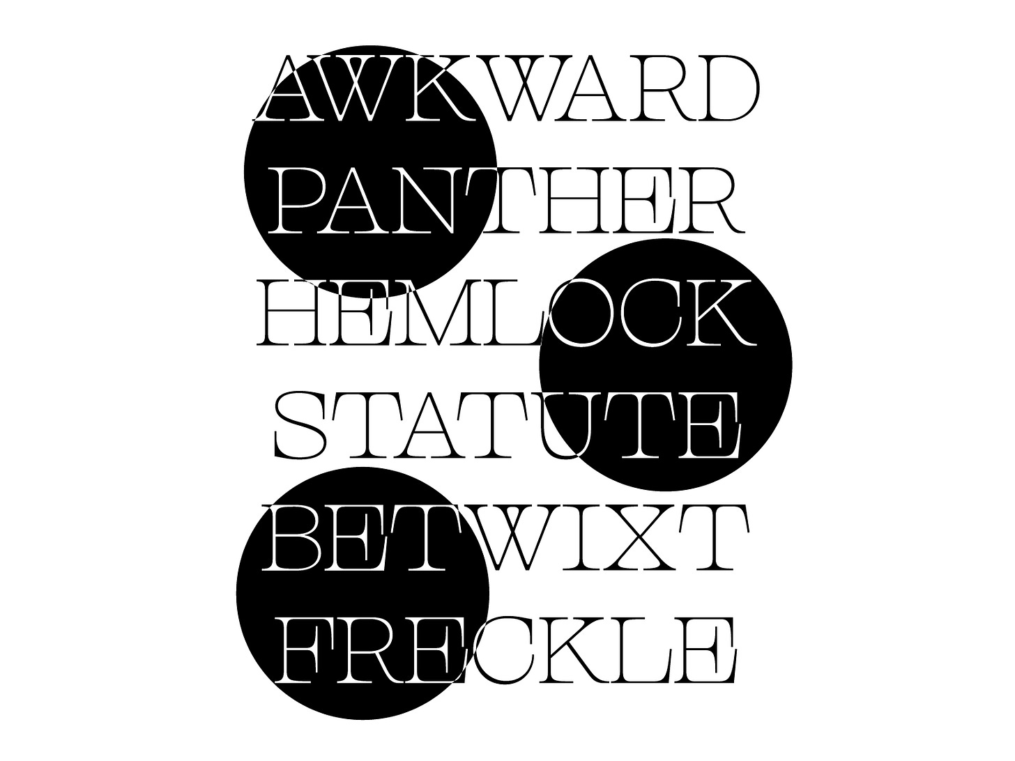
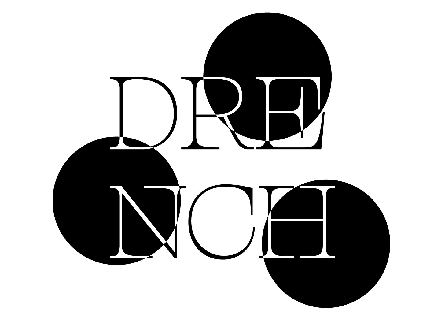
Looking at the finished product, it actually gives editorial vibes which I looooove. I picture this used for fancy perfumes or a fashion line. Maybe a knitwear brand by yours truly?? Lastly, I just want to thank everyone for participating. This project sometimes feels like I’m sending things into the void but this week has revived me quite a bit!! Next week, we’re going to do a halloween deep dive. I will be sharing some B-movie posters, maybe some stuff from the Letterform Archive, and explore what makes fonts creepy! Can you help me decide if I should try attempt make a font that’s actually scary or something kind of silly?
Here are five things I’m into this week:
I listened to the Weekly Typographic’s most recent podcast episode. They talked about why Victorian type is creepy!! Major inspo for next week.
I’m re-obsessed with Project Runway! There’s a new season airing and I forgot how good it is.
This article (+ the font) about Compact Black! I’m loving the boldness + nods to soviet history. Really cool!
Pre-ordered this book about diacritics: Manual of Diacritics. Looks like it will be very useful!
The Letterform Archive is now accepting applications for TypeWest 2022! I attended the 2019-2020 year and it was one of the best things I ever did. The instructor line up is so amazing for next year. If you have ever thought about going to type school, now is the time!! Feel free to shoot me an email if you have questions about the program.
Thanks for sticking with me for 26 whole weeks!!
Lyl,
Libbie
P.s. — The name is inspired by the fact that it’s raining in (some parts of) California! Yay!


