Happy Friday!!
I don’t know what it is about daylight savings time that has made me feel so productive. I’ve been going to bed early and waking up early — it’s truly an underrated thing! Now I understand why my dad is so proud of himself for waking up at 5am everyday. I feel the same way about waking up at 7:30 lol.
This week I made something I am truly proud of (for once). For my birthday earlier this year, my dear friend Kat gifted me a couple vintage knitting magazines. Literally the perfect gift for me. While I was paging through them, I noticed that the ads were truly superb — like, maybe cooler than the knitting?? The type in them was much more interesting than current-day ads. Back then, most things were designed in a paste-up environment and the design elements (type included) were done by hand. The scripty bits are very charismatic and feel like handwriting (because it probably is). It’s handwriting that we all definitely aspire to have.
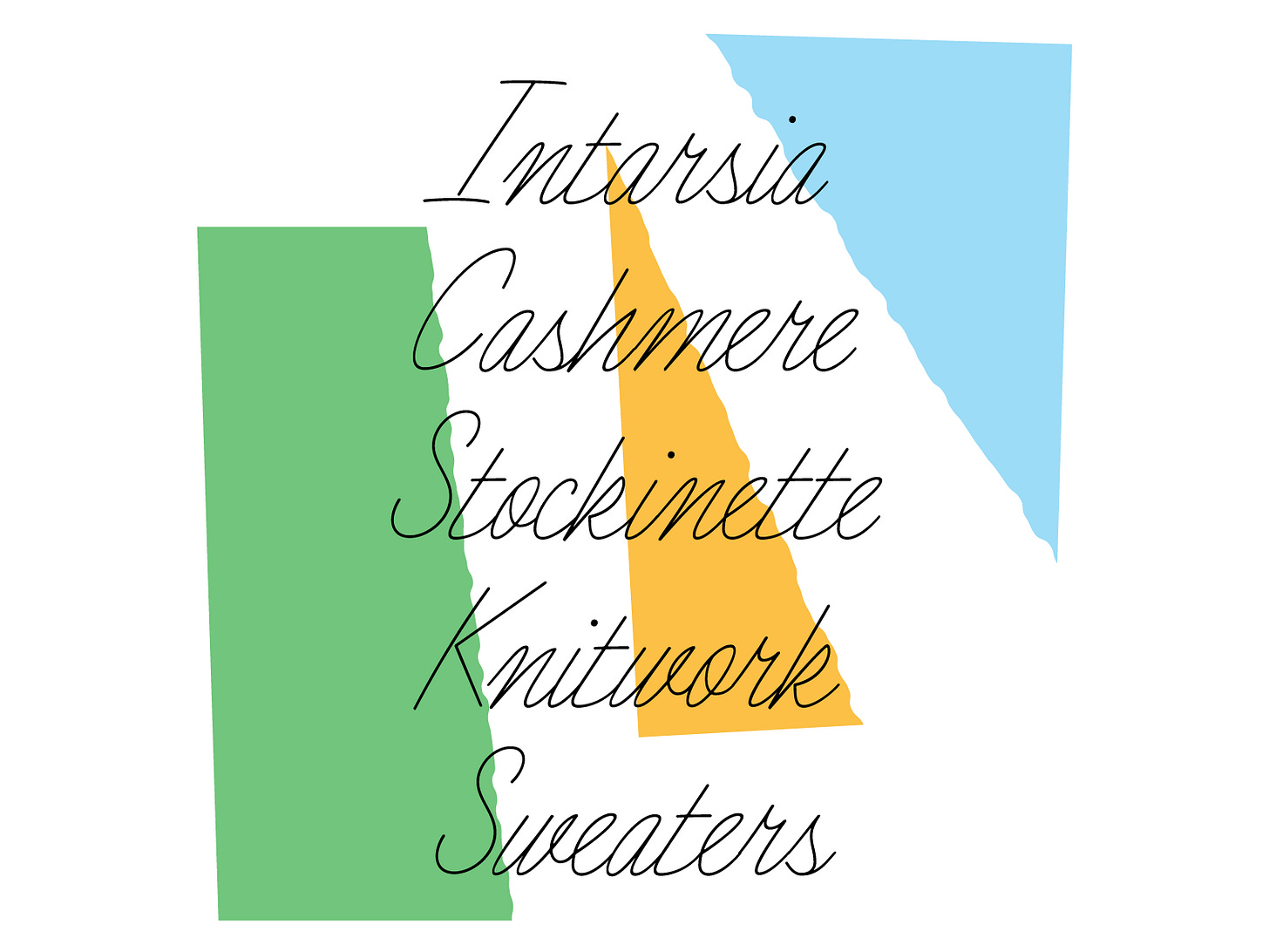
Designing a connected script has been on the list for so long that I couldn’t resist the siren song any longer. I have made a couple partial scripts before so I wasn’t going into this process totally blind. There’s a Victoria Rushton talk that I’ve recommended before that is/has been immensely helpful whenever I dabble in the connected script world. I knew that it would be beneficial for me to do something that feels like handwriting so that I can have some weird bits and simpler caps that don’t feel out of place. That’s why the advertising script from the knitting magazine is so perfect! It’s just got the vibe, ya know?
The process was pretty straight forward. I used the screenshot words and started designing some letters. I leaned heavily on the offset curve function in Glyphs so that I wouldn’t have to fuss with making perfect monolines. It took a few tries to get the connection point in the right spot. If it’s too high, the alphabet feels a little swoopy and the connection points can land on a confusing/unnatural spot. If it’s too low, then the letters have to be scrunched together to make it fit. The ultimate trickery with designing connected scripts is to only have an exit stroke and no entry stroke. Then you don’t have to fiddle with random connection points as much. It also circumvents the need to have a bunch of ligatures and stylistic alternates for problem letter combinations. I’m proud to say that there are no ligatures, alternates, or substitutions in this one! Each letter works with the others. However, if I was going to flesh this out I would definitely include some so that it feels a little more elegant in some situations.
Conclusively, I am happier than I expected to be about this project. It went very smoothly given how quickly connected scripts get scary!! Please use this for all your yarn advertisements, hipster wedding invites, and long-winded love letters to your long lost lover. You’re all the best!! Thank you for being here and I’ll see you next week. <3
5 Things I’m Into This Week:
Type West applications are due this Sunday!! If you want to learn from super talented type designers, this is your chance!
OHno released their “Some Tips on Drawing Type” zine! Get yourself a copy.
If you’re into knitting, come join a little online community called Knit Club! It’s free to join and a fun spot to share your work and ask questions.
I’m listening to the book, The Man On The Train. It’s so good but it’s making me a little paranoid!!
I don’t really have a fifth one but I thought this tweet was interesting.
Have a great weekend!!
Libbie


