Happy Friday!!
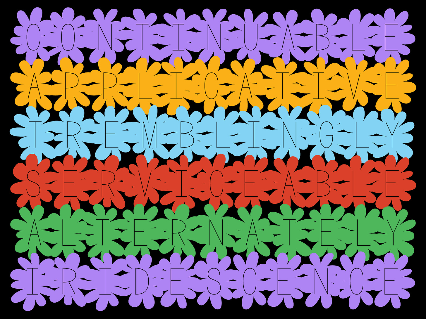
Welcome to week 30! It’s so wild that I’ve been doing this project for that long. This week, I took a little break from Serious Type Design™ to make something a little playful and weird.
This idea has been on the list from the beginning but when it was suggested during my week 26 typecooker, it moved its way up. For weeks, I’ve been drawing it in the margins of to do lists, digitally sketching it, hating it, and then moving on to something else. Rinse and repeat. After doing a challenging connected script last week, I thought this would be the perfect little palette cleanser. It’s part normal font, part dingbats, but mostly me just playing out a weird idea.
The tricky thing about this one is that it blatantly goes against everything I learned when studying type design. The flower backgrounds are purely decorative and the letters themselves are fairly simplistic. My type instructors would have hated it, but somehow, I still really like it?? Maybe because it’s so cheesy and unpretentious? Maybe we all take type design a little too seriously? Sometimes you just need to make the flower font and get it out of your system.
Conceptually, the flower idea was a little bit difficult to nail down. I drew a lot of sketches and iterations. Most of them were letters made from flowers or petals but it just didn’t look right. They could’ve been mistaken for a bowel movement that rhymes with stoop. To pivot a bit, I decided to make a layered flower font that is functional as a flower dingbats or a flower font! The letters can be used solo as well but will be a little tracked out from accommodating the flowers.
Conclusitively, I like this font but I am fully aware of its limited use. Use it in your next corporate presentation to spice things up a bit or just make a little flower lock screen background. Have fun for once! Live a little! You can do it!!!! Anyways, next week is a holiday in the US so I will probably add lowercase to Knotical (week 8) or add uppercase to Alexander the Babe (week 1) to accommodate the short week. We will see!
5 Things I’m Into This Week:
Supporting this kickstarter, The Black Experience in Design. A collection of essays from over 70 creatives and one of them is current Type West student (and all around cool person), Schessa Garbutt. Can’t wait to get my copy!
The song, It’s My House by Diana Ross has been on repeat. I change the lyrics to be “It’s Mo’s house and he lives here” so that when I sing it to my dog he wags his tail. <3
This article that has circulated a bit this week. Written by Frank Adebiaye.
In tandem with the article, Monotype’s type trend forecast for 2022.
Completely overhauling my workspace and getting a new desk that is literally the perfect size. It’s this one if you’re curious.
Have a great weekend!
Libbie


