T-G-I-F!
Can you believe it’s been a month already?? I’ve been on a type design rollercoaster this week! I really struggled to pick a direction. I kept designing and sketching several things and then digitized a bunch of things at once. I almost threw in the towel and went with dingbats! Ultimately, I decided to stay within my comfort zone and made something reverse contrast. (For Type West, I worked on a reverse contrast family for most of 2020.) It’s fun and poses some interesting challenges.
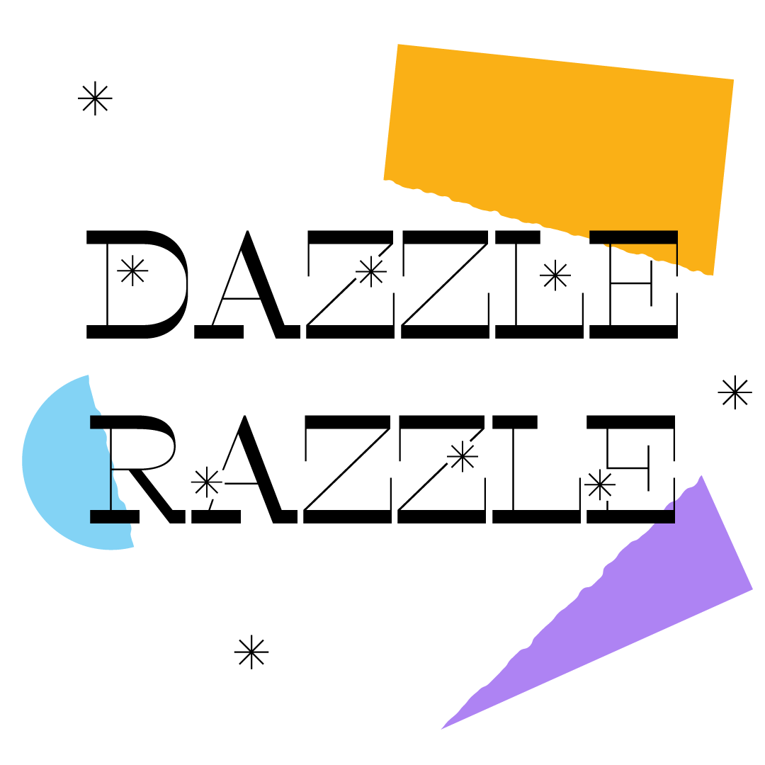
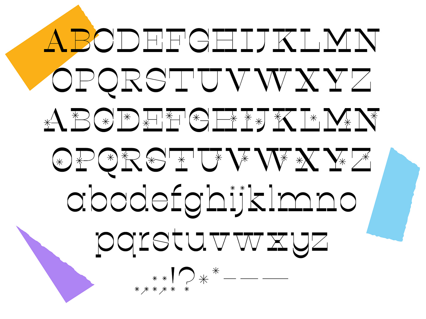
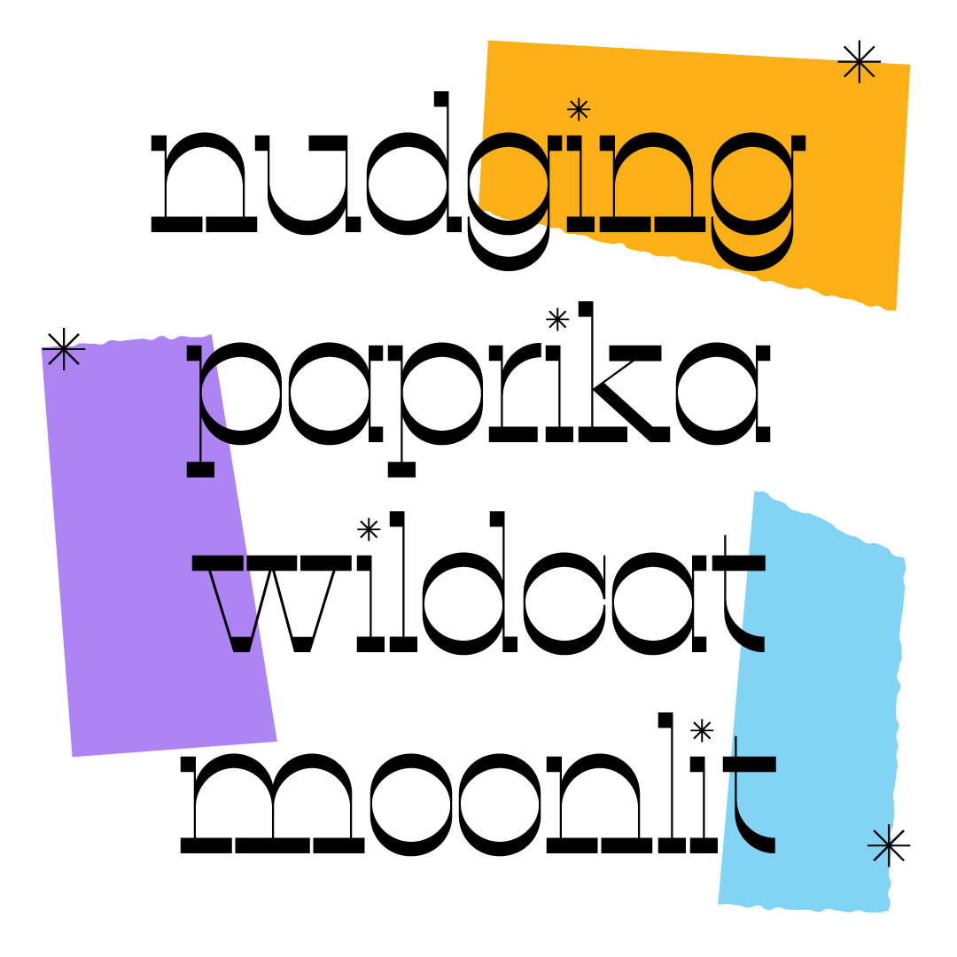
This week’s font is Dazzle Razzle. It’s a high contrast, reverse stress font with a set of stylistic alternates for the caps! I decided to go with a sparkly theme this time. I don’t know what inspired it but it might have been this song that has been stuck in my head all week. Dazzle Razzle has caps, lowercase, stylistic caps (with sparkles), and some basic punctuation. I’m picturing it on a sparkling water label or a NYE party invite. If you use this for an invite though, you have to invite me. I don’t make the rules.
Download :]
Have a great weekend!!
Libbie
P.s. — Just wanted to remind y’all that the fonts are only available for one week! As soon as you get a new email from me, the previous week’s font will no longer be available. Get ‘em while they’re hot! :)


