Howdy,
My name is Tommi and I’m filling in for Libbie this week! Libbie and I both attended the same type design program in San Francisco at The Letterform Archive (formerly Type@Cooper West, now called Type West). We bonded through our love of handmade things and learning about type design as both students and then teaching assistants for the year long program.
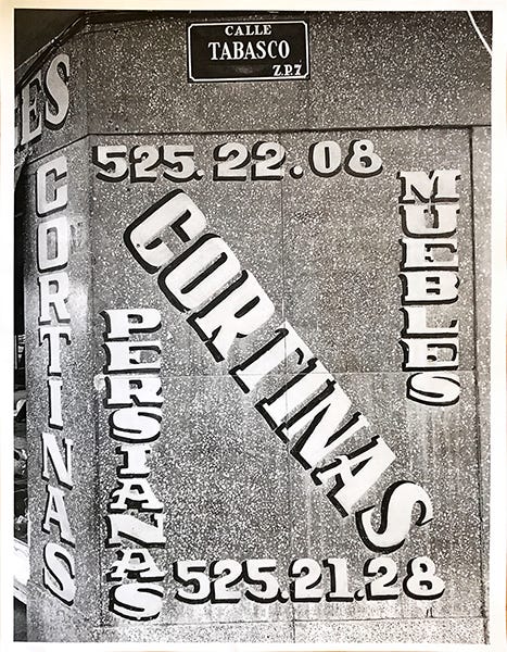
In the spirit of Libbie’s equally insane & awesome project, I’m sharing a font that I created in a week from my time at font school. My task was to make a font based on this photo one of my instructors, Frank Grießhammer, took while in Mexico. It’s advertising various home furnishings.
I approached this by writing out some rules for myself (like a TypeCooker recipe) of all the characteristics I liked about it: vertical stress, high contrast, condensed, normal weight, mixed stroke endings, and made with a brush. Then I put the photo away to take a stab at my first draft. I tried drawing it from memory so I could attempt to put my own flair on it.
The thing that I intrigued me the most about it was the sign-painter’s seeming disregard for making all the stroke endings the same. The motion of the hand seems to decide whether a serif is bracketed or a slab. The shape of the endings of C, G, ?, and some of the numbers are a product of how I would handle those shapes with a flat brush in my hand following the same logic.
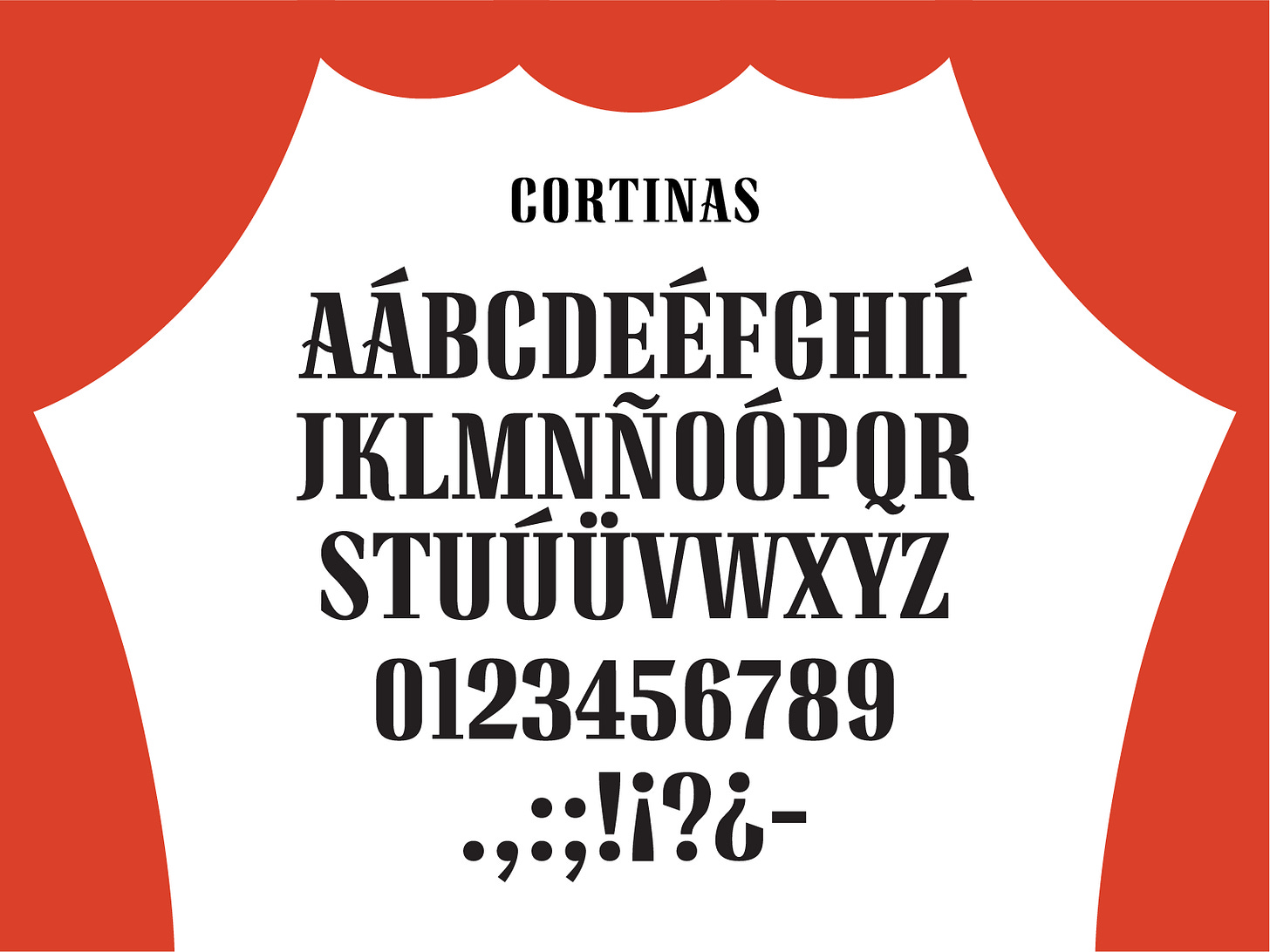
The result of revisiting the design this week— A dramatic all caps font complete with new numerals, refined spanish diacritics, and basic punctuation.
I’ve been calling it “Cortinas” in honor of the source painting. It translates to “curtains”, which seems fitting since the forms feel very theatric 🎭 to me!
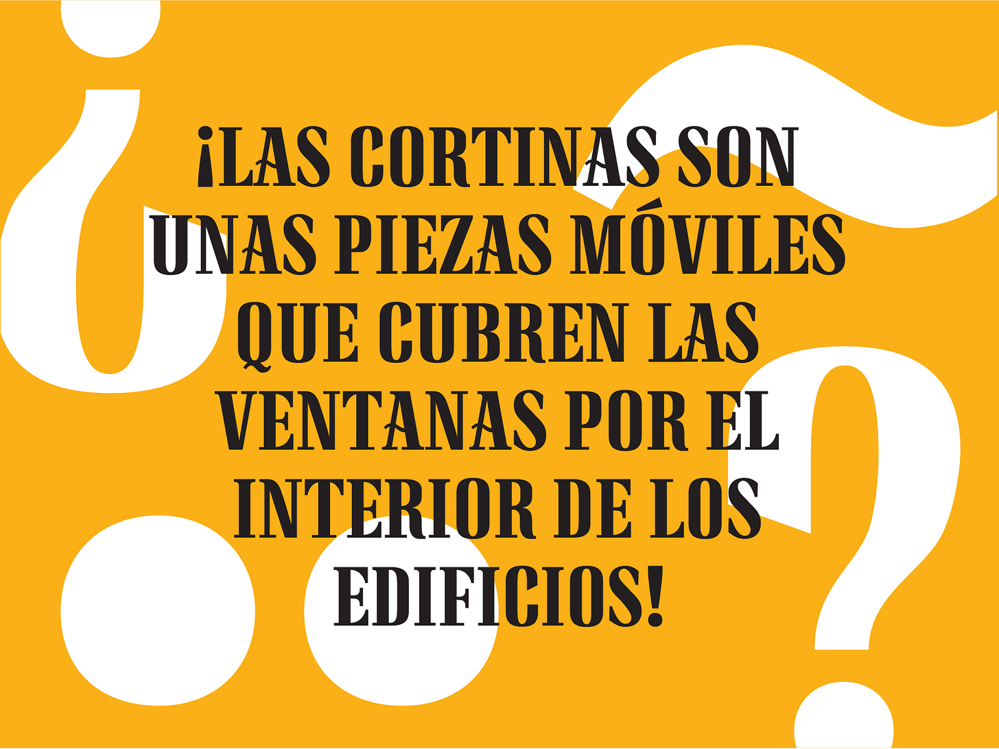
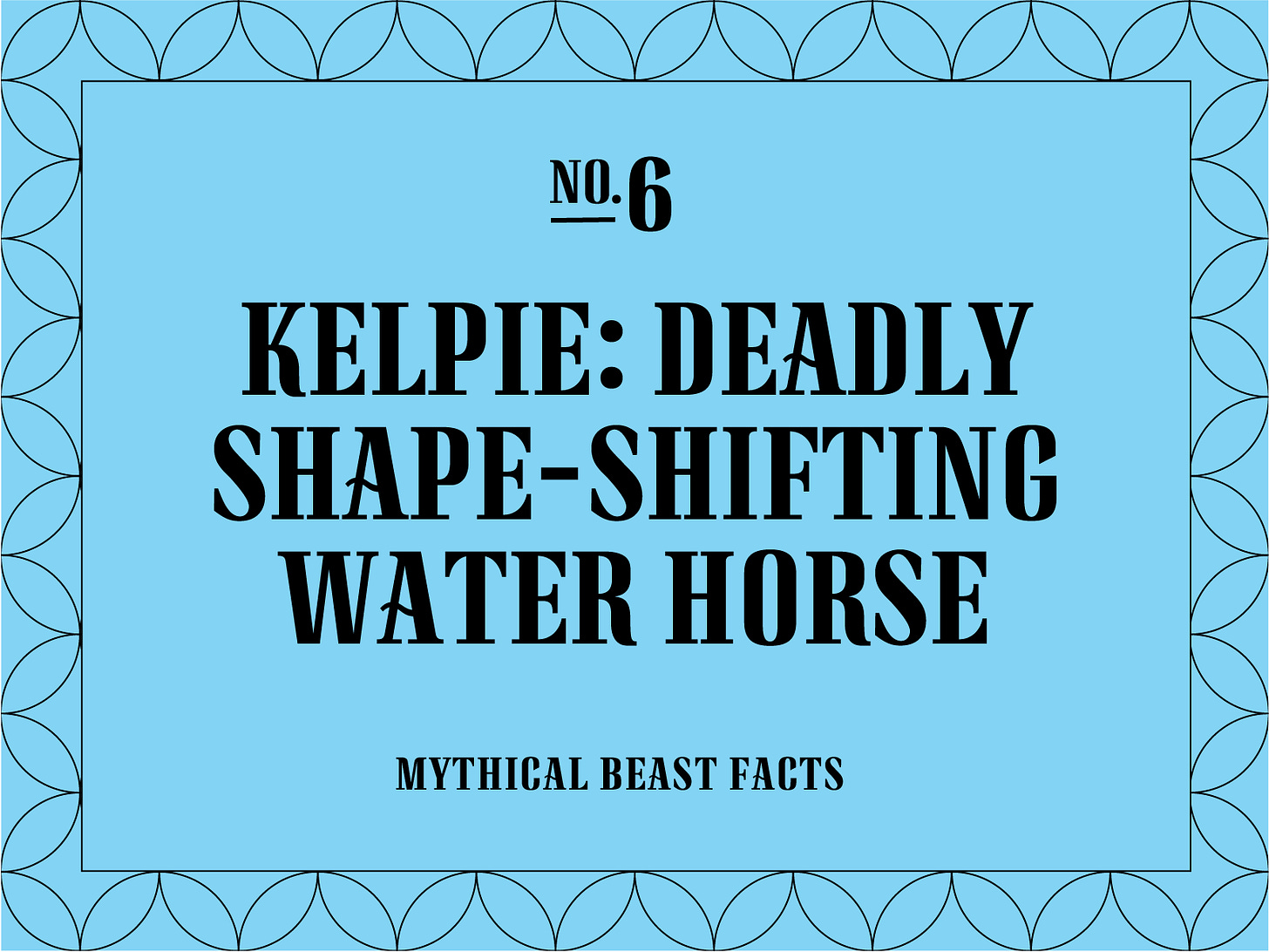
I can see it being used for editorial headlines, fashion brands, adventure/fantasy novel covers, or simply to spice up that yard sale poster you need to make for your mom this weekend.
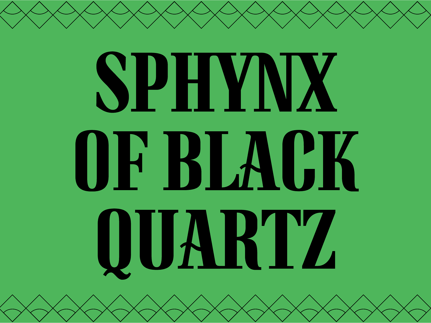
Thanks to my Type@Cooper West instructors for their guidance and inspiration for this project, to the amazing Laura Garcia for taking a look and giving me some great feedback, and of course, to my gracious friend, Libbie for hosting me this week!
And since I love Libbie’s weekly feature— I’ll leave you with 5 Things I’m Into This Week:
Just finished The Witcher Season 2. I’m singing the bard’s songs way too much lately 😅
I’m re-listening to old episodes of my fav non-design podcast, Every Little Thing. Did you know that most office plants in the US come from one city? I didn’t. Check it out: https://gimletmedia.com/shows/every-little-thing/z3hl62/the-hide-rug-of-the-plant-world
This guava ginseng tea is making me dream of summertime. It’s the most fragrant fruity green tea I’ve ever had. 😍
Next week is the final class of Intro to Modern Type Design that I’ve been TAing for Kel Troughton. If you’d like to join in on the next one, stay tuned! They should offer it again this summer: https://letterformarchive.org/events/
Laura Garcia, who shares my love of Animal Crossing and lettering, is on Instagram @lauragarcia. Do yourself a favor and check out her work!
BTW If you like my font, would you consider subscribing to my own newsletter? I’m launching a foundry soon and I’d love you to be the first to know about it and the fonts I have coming soon!
Thanks for reading,
Tommi


