Hey y’all!
I’m writing you from the distant past! It’s Wednesday and I’m finalizing everything tonight so that I can go on a (desperately needed) camping trip this weekend. By the time you’re reading this, I’ll be posted up in a hammock with my knitting and some earl grey tea (with a splash of cream).
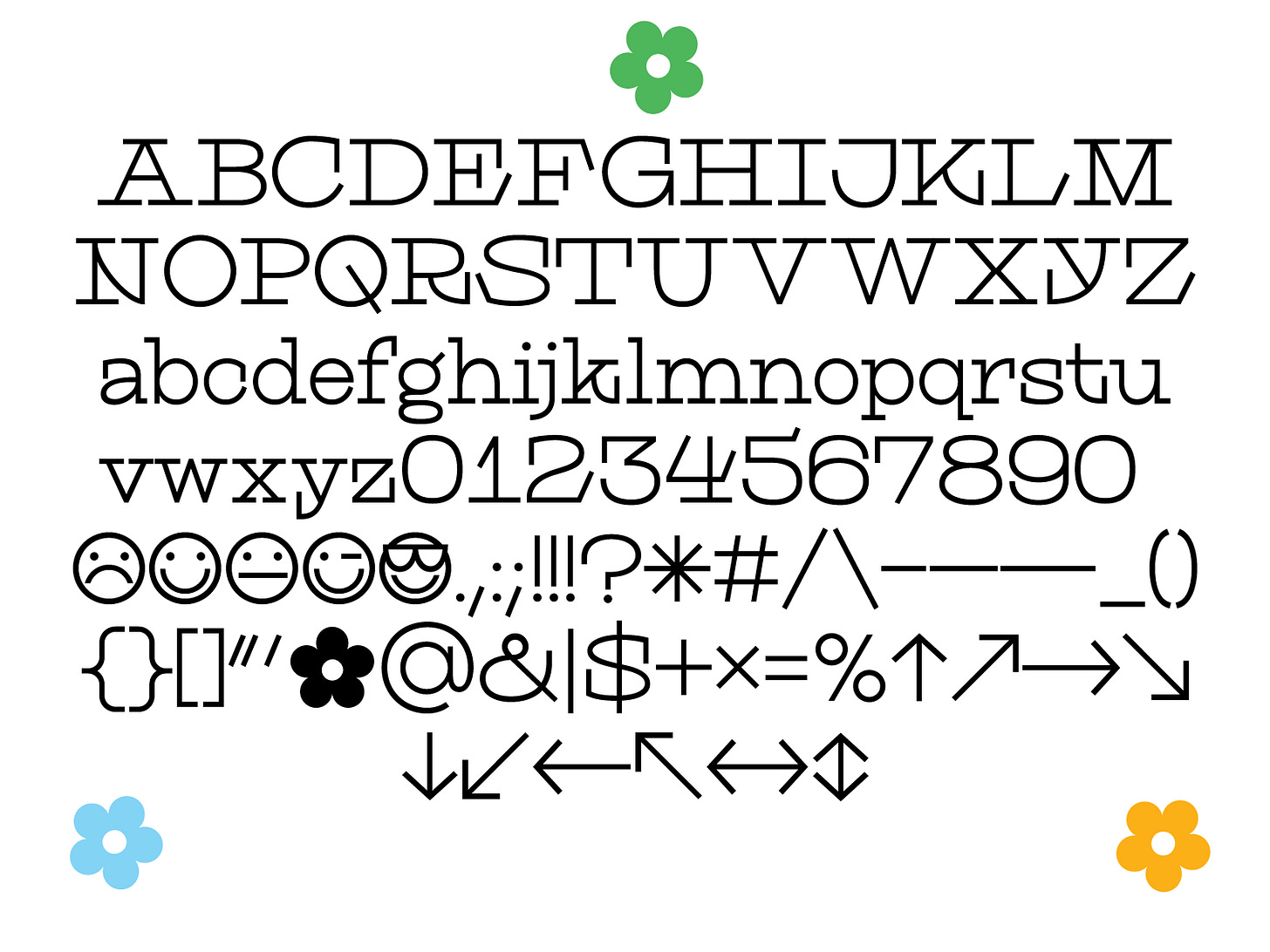
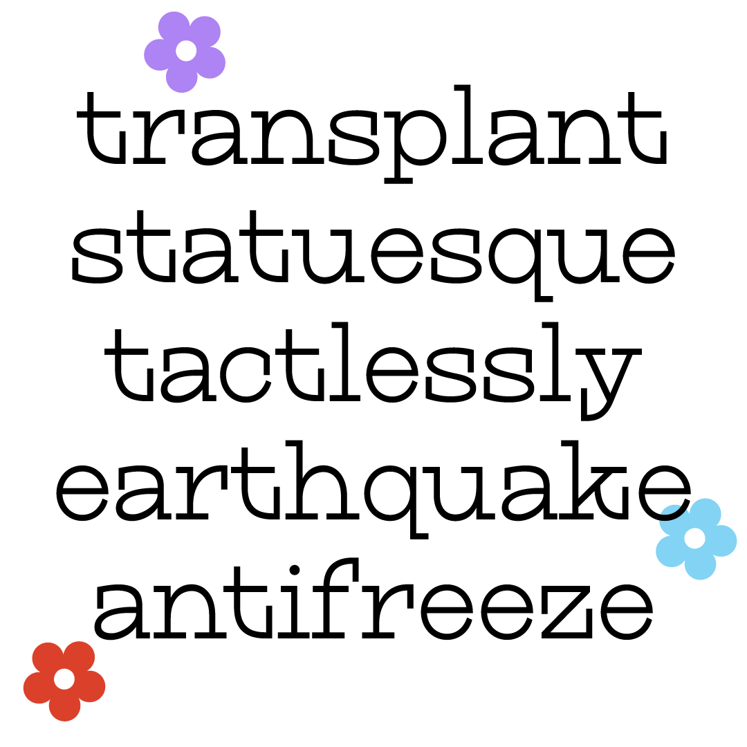
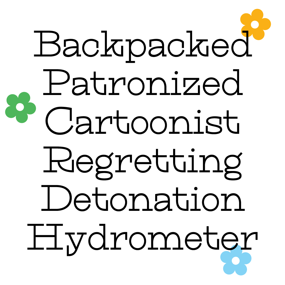
Given that this is a short week for me, I decided to do something appropriate for the timeline. I revisited Scraps and added the lowercase! For some unknown reason, Scraps is/was the most joy I’ve ever gotten while designing type. I have no idea why. Maybe it was the most perfect balance of weird but also straightforward? We may never know!
It was really difficult to add the intense vertical serifs from the caps into the lowercase. It’s the kind of thing that adds way too much weight and felt really distracting at times. Letters a and g were the most difficult to make (jury’s still out on the g, tbh). I realized this week that I’m starting to see a lot of little details that never bugged me before. Like I fussed with the x-height and overshoots quite a bit more than usual. Maybe I’m starting to level up my *eye* for it all.
I hope you enjoy this second round of Scraps! It is definitely on my “to release in the future” list. Excited to come back next week filled to the brim with fresh air and reeking of campfire!
Have a great weekend!
Libbie
P.s. — I’m TAing for the Introduction to Modern Type Design with Kel Troughton this summer. It’s on Wednesday evenings from 5-8pm Pacific Time from June 16th - August 18th. It’s a great way to learn about type design and make your own original typeface! Sign up here! It’s first come, first serve — sign up asap to reserve your spot!!


