Happy Monday y’all! (and Happy Memorial Day to my fellow Americans!)
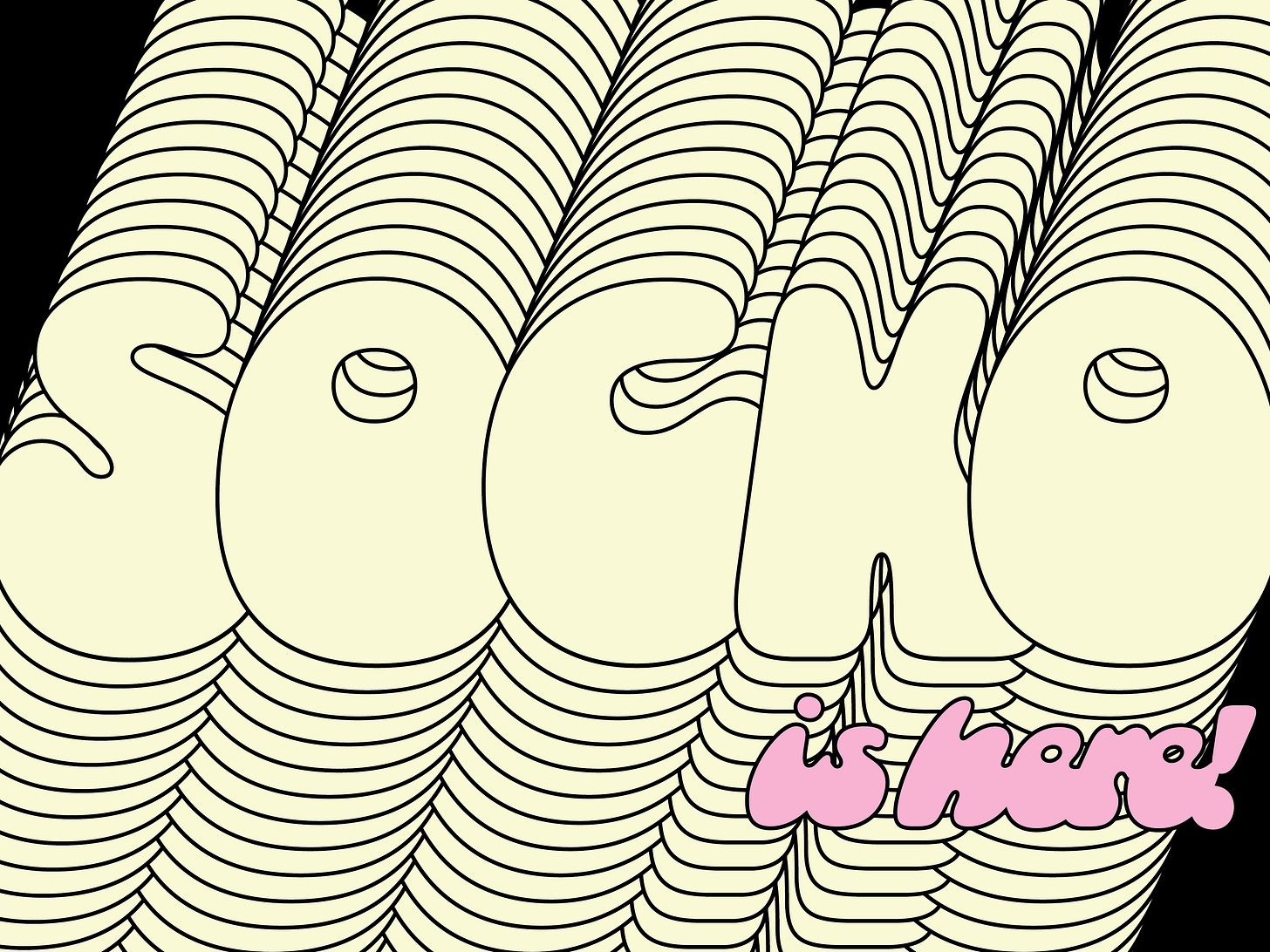
I am happy to announce that Socko is officially released from my reluctant, perfectionist hands and available on overlaptype.com. I’d be lying if I said I wasn’t incredibly nervous and definitely didn’t push the release date TWICE!!
Because I am releasing Socko through my friend and fellow typographic comrade, Kel Troughton’s, type foundry — I thought it would be fun to include him in this extra special release email. I’m sure you’re sick of hearing my blab about Socko anyways!!
We decided that it would be fun to ask each other some questions about Overlap Type, Socko, and general type things. Enjoy!!
L: To kick us off, could you give us the inside scoop on how Overlap came to be? What gave you the idea? What do you hope it will become?
K: The name and foundry concept is something I have been thinking about for only about a year but the idea goes way back. Coming from a background in graffiti, It is strange to see a piece or drawing that doesn’t overlap, it’s essentially part of my training in letterforms. When I was in type school learning to make traditional latin forms, it was clear that rules based on metal typesetting aren’t helping a design be expressive or fun in the modern era.
Overlap Type is based around the theme of overlapping, and trying to offer something new to the design world. I have a lot of ideas that stem from this concept, but it has been awesome working with some great designers and friends who are adding their own flavor to the catalog, like you! Stay tuned for more, and think of Overlap when you want a non-conventional headline typeface.
L: As a designer with a graffiti background, what is one graffiti tip or trick that you use that is not taught in type school?
K: Besides the obvious namesake of overlapping your letters… maybe repetition? It’s not that type is not tedious because it is, but graffiti writers are constantly drawing and improving on earlier versions of drawings. I think it is good to sit with a couple good letters and rework the rest in sketch form for a year before you are ready to start making a font. Give your self time to revise and also time to be inspired and experiment. That’s something I got from graffiti but I think good type designers do this as well.
L: We also have to mention that you have a graffiti class happening soon through Type Electives!! It will be a fun way for others to learn all your helpful graffiti tricks.
K: So Libbie, living in Santa Cruz, CA you just have no shortage of chill and cool businesses that could be using Socko in their branding. List a couple ideal local use cases (and how you would want them to use it).
L: One of my favorite Santa Cruz businesses is Darco Printing and Paper. It’s been around forever and they always have all the fun paper supplies I need!! Another fave is the yarn shop I work at on the weekends. I can’t help but think some knitting-pun stickers would be so great.
L: Okay, goofy question o’clock! If Gnar, Boiga, and Socko (Overlap’s debut typefaces) had a conversation, what would they talk about?
K: Summer vacation destinations for sure. Gnar is probably a friend from college while Socko and Boiga grew up together and have a similar level of chill. I think they would all be headed to the same river spots and they would be be bringing the same flavors of La Croix (lime or tangerine, not coconut).
K: Please use inanimate objects to explain Socko, and use percentages (14% Inner Tube, 8% Cantaloupe, etc).
L: Socko is 63% bananas, 16% marshmallow, 9% weed gummy, 8% neck pillow, and 4% cherry-scented car air freshener.
K: We come from the same school and type community surrounding Letterform Archive, and I am wondering what you like most about that type scene?
L: I love how unpretentious everyone is! It’s really easy to make friends and get to know each other. We cheer each other on instead of treating each other as competition!
K: I love how 60s-70s Socko feels, do you have any other typefaces from that era that you vibe with? Any direct inspiration from Photo-Lettering Inc?
L: My favorite typeface from that time period is Motter Ombra by Othmar Motter. It’s nothing like Socko but it’s still really funky. Socko feels more like psychedelic poster meets Schoolhouse Rock.
Socko actually doesn’t have any direct typographic references outside of the original reference. Socko is based on lettering I found in a 1950s knitting magazine!
L: And finally, to wrap this all up: where is the best place to follow along with everything happening at Overlap Type?
K: By the time you see this you can go to the website overlaptype.com and also sign up for our newsletter. We can be found on Instagram and twitter @overlaptype !
And with that, please check out Socko! I worked very hard on it and am so proud!! It’s so crazy to have my first, fully developed, typeface out in the wild!!
Talk soon,
Libbie
P.s. — My TDN updates will be monthly from now on! I think it will fit better with my workload and schedule. <3
P.p.s. — My classes through Type Electives are open for enrollment for a couple more weeks! Check them out here.


