Heeeeey!
It’s Friday! I had such a good time this week working on this project. It’s nice to work on something new and challenging. It’s a first for me — a variable font! I have dipped my toe in the variable pool once or twice before but never finished anything.
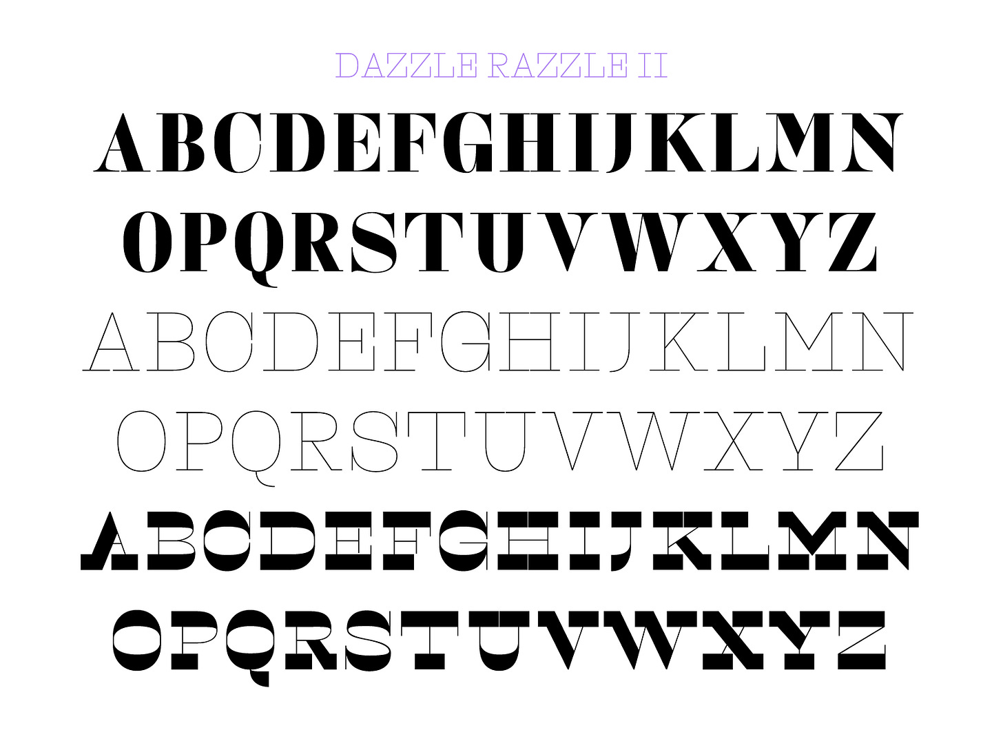
Knowing that I wanted to design a variable font, I looked back on previous weeks to see if there were any fonts that were a good candidate. When I saw Dazzle Razzle, I knew that the simplicity of the design would translate really well into something fun. I began with the word CHAOS. It’s good to start with a test word that contains your control characters (O,H) plus a letter with a diagonal stroke (A) and a problem character for the design (S). This way you can see if it’s going to work in most scenarios. I wanted to do something more fun than just adding weight or slant to an existing design so when I tried changing the contrast model, I knew I was on to something. It was relatively simple to complete after I worked out some kinks like the vertical serifs (see original blocky serif idea in my ig post).
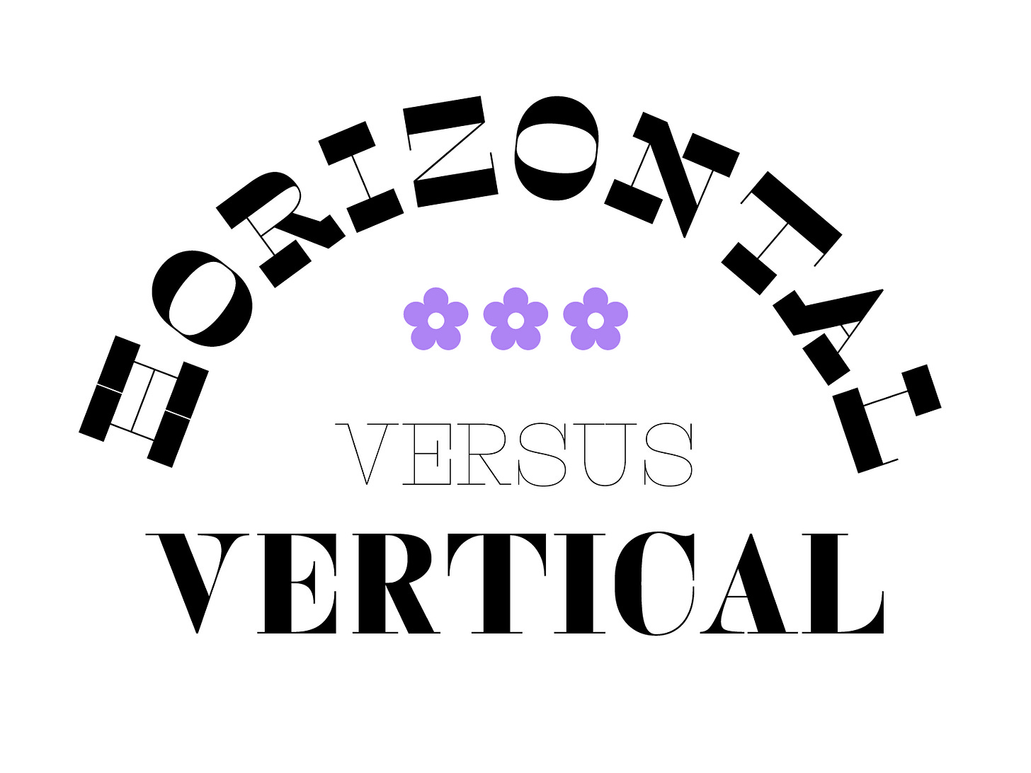
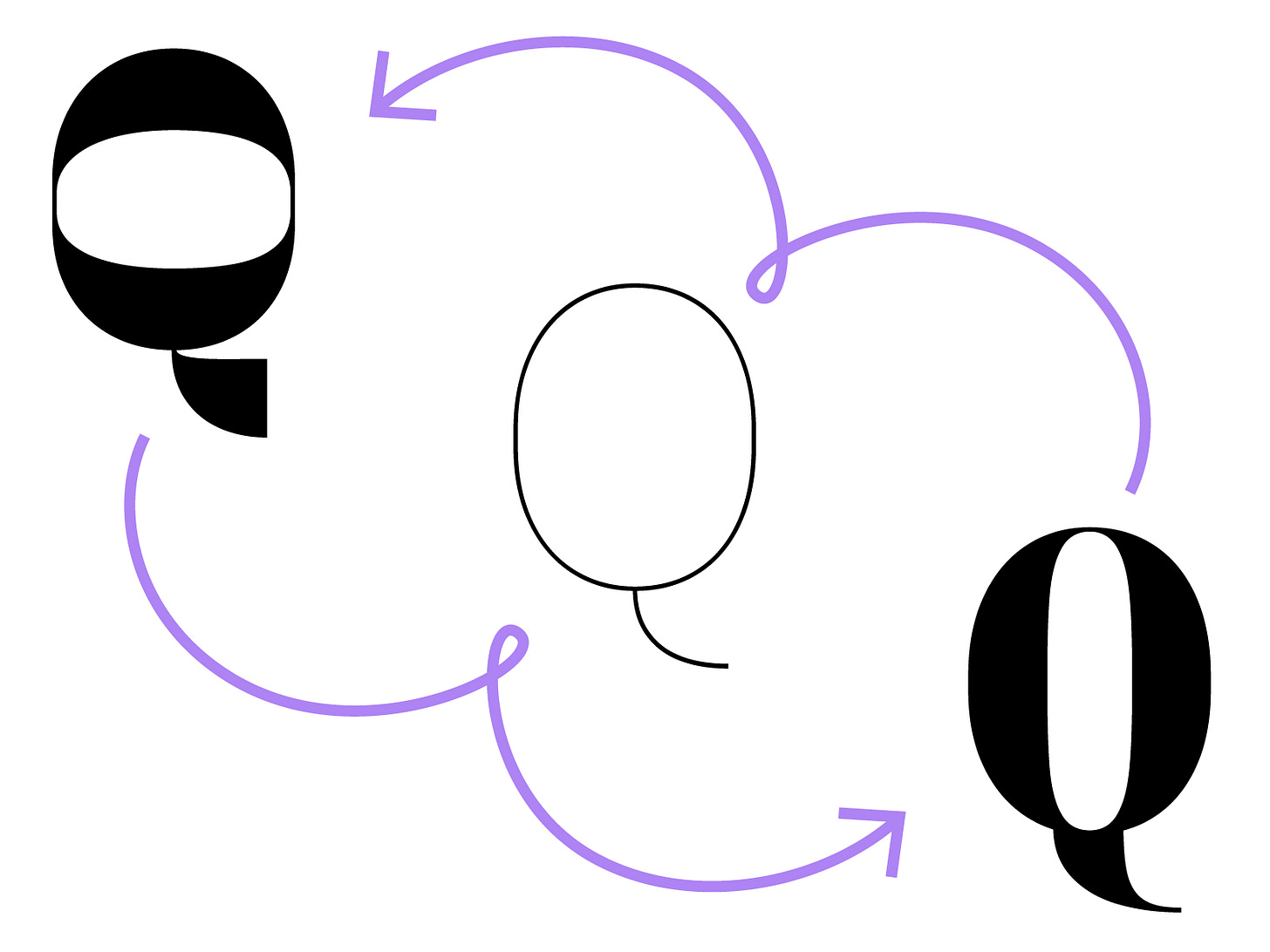
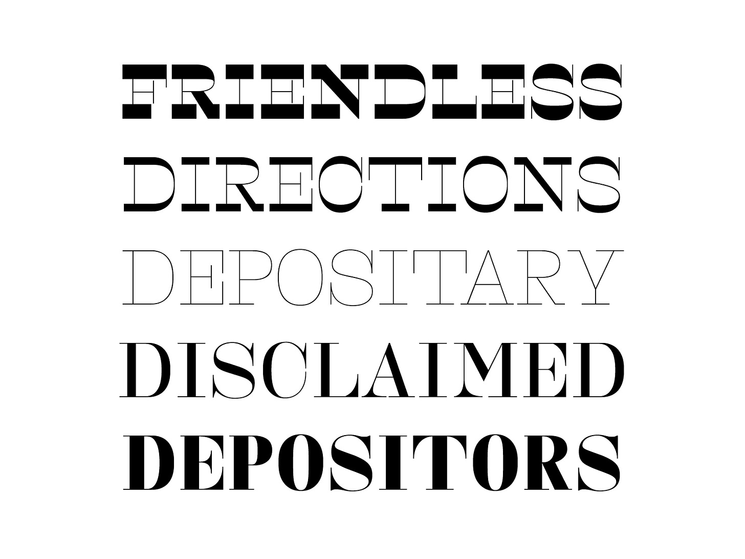
My overall concept for this week was to transition from reverse contrast/horizontal stress design to a light monoline and then to an expansion contrast/vertical stress design. It’s wild that you can start with the same skeleton and create three completely different fonts. Although some design preferences had to be sacrificed in order to accommodate each style. For example, the diagonals in the X might have shifted more between the two extremes but when you add the weight and change the position of something, the transitions between styles can get a little funky. Oftentimes, I had to find a middle ground. All in all, I am stoked about how this came together. I hope y’all get a chance to play around with it! It’s three times the fun!!
Five things I’m into this week:
I basically lived in the Dinamo Darkroom’s Font Gauntlet this week: https://dinamodarkroom.com/
Lately, I haven’t been very inspired by anything graphic design related but I rediscovered Are.na and it’s helped revive me a little! I highly recommend. It’s like a curated/arty pinterest but without an algorithm or ads.
Seasons 1 & 2 of To Live And Die In LA — A long-form true crime podcast that kept me company last week after I got tired of watching TV.
An organizational tool that I think will work for me! It’s called OmniFocus. It was recommended by my friend Tommi Sharp. <3
The show A Great House Revival (on Hulu). I found this while I was sick and it was a good time killer. It’s based in Ireland and it’s a show about people who are updating old (sometimes ancient) houses. It’s a great show to watch while you’re working!
See you next week!
Libbie
P.s. — The .ttf file is the variable font but I included .otfs of the three main styles as well!


