

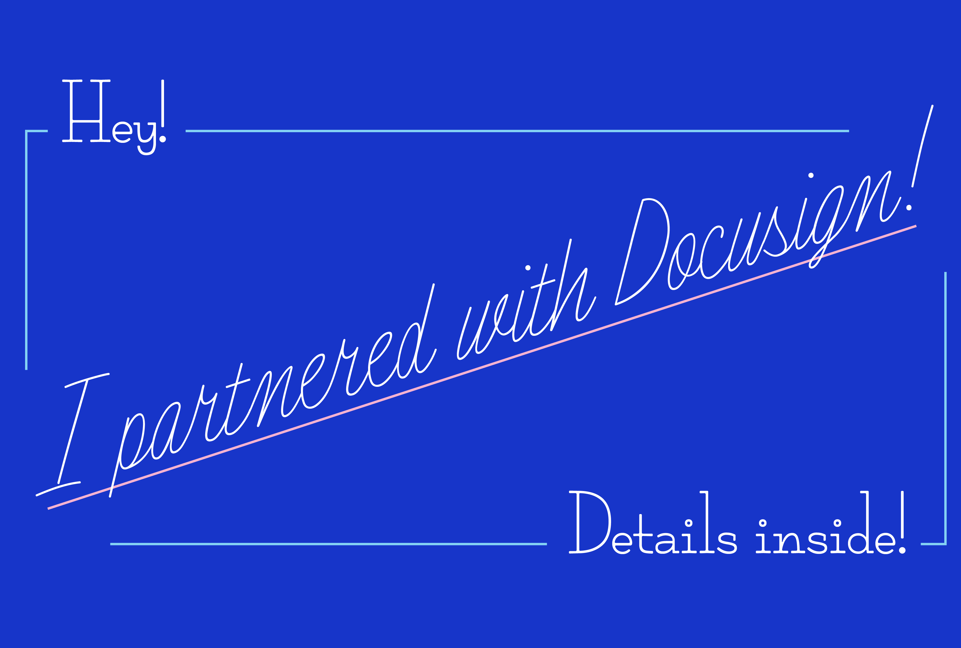
Hey hey!
It’s been a little while since I’ve written and I truly hate to be away from you — it feels like I blinked and somehow missed June!! I have a really fun update for you today. I’ve partnered with Docusign to add two new typefaces to their eSignature styles! It’s been an absolute dream to work with them and I feel so honored to have my typefaces live in this space. The typefaces are launching soon and I’ll be sure to let you all know when they’re live!
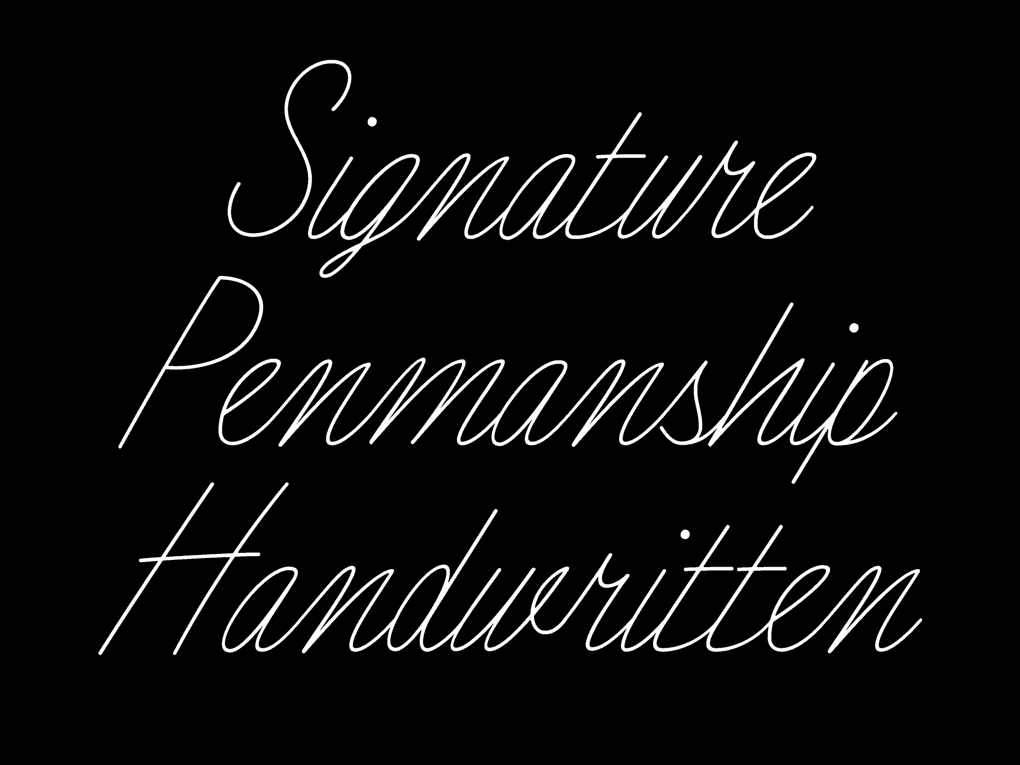
Today I want to talk to you a little about the typefaces! When Docusign reached out, they were looking for typefaces that have a handwritten feel. They really liked Stockinette and Rhub from my 52 Fonts project. (If you remember when I made those, then you’re a true TDN OG and I love you forever!!) These two typefaces were some of my most beloved from that project and I am so excited that I had an excuse to finish them.
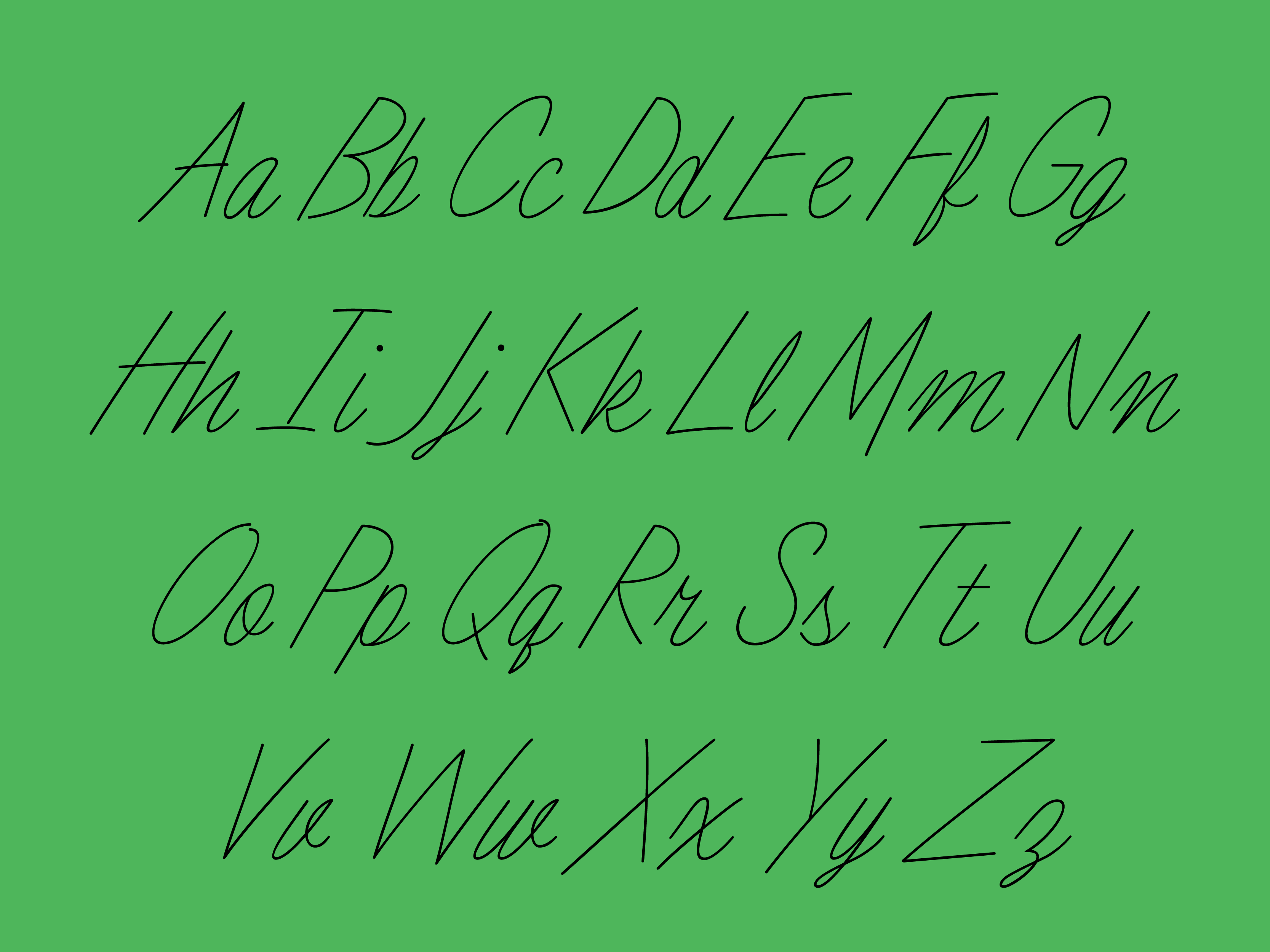
Let’s talk about Stockinette first! This typeface was inspired by handwriting that I found in a vintage knitting magazine. It was that very specific type of mid-century felt-tip cursive that is quick and has a casual vibe. It’s from a time before digital typefaces existed and so graphic designers would often supplement the type with handwriting/cursive. I assume so that they didn’t have to set more type!
Usually when I pick up an old project like this, I get the urge to change a lot of things but that wasn’t the case here. Stockinette was very resolved and I only made a few tweaks to the existing design. I ended up adjusting a couple of the connection points, fixing a few curves, and adding kerning of course!


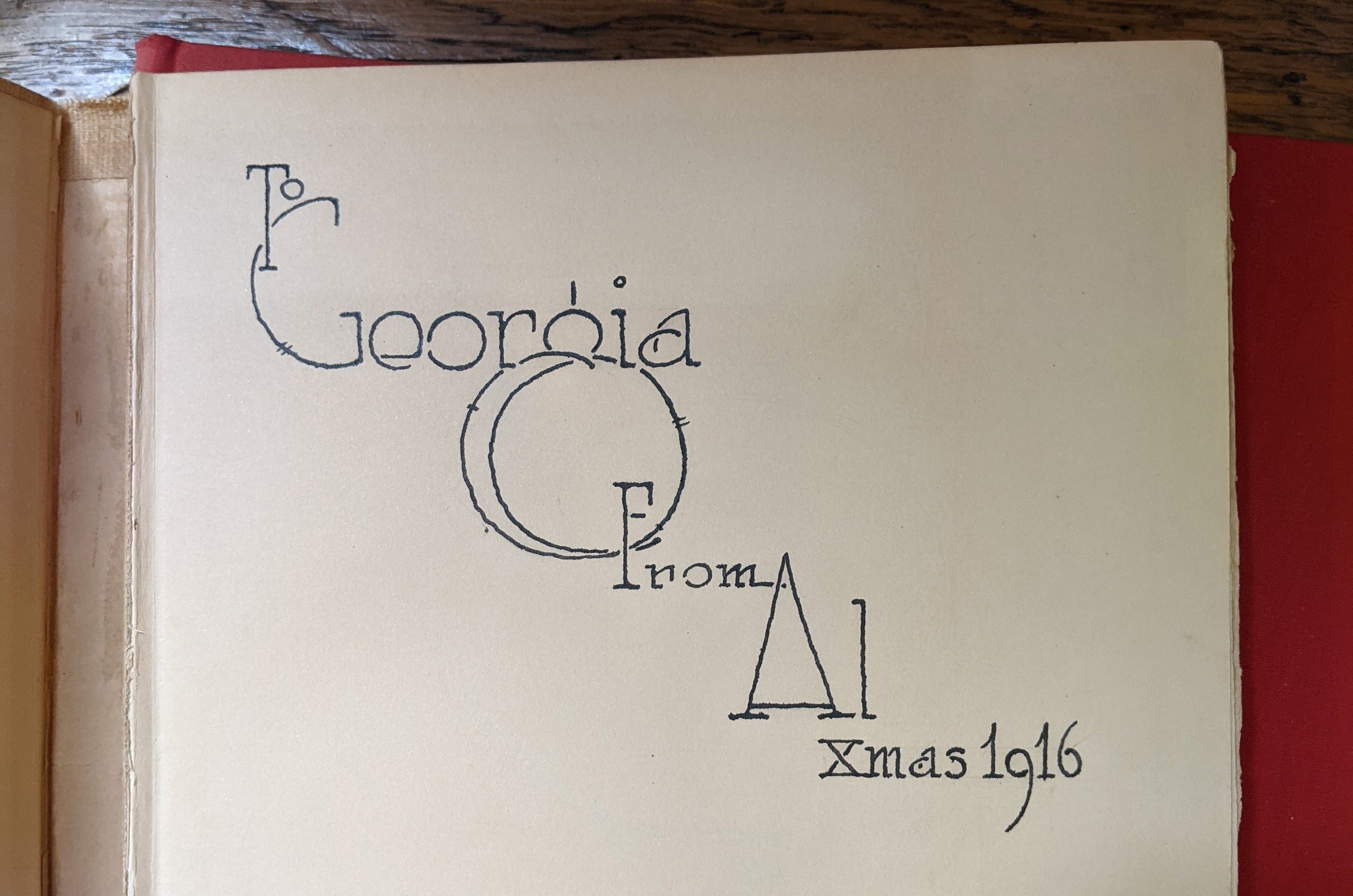
Do you remember Rhub (short for Rhubarb)?? It is such a cutie and I am so excited that Docusign selected it. I found the original source on the inside cover of a book. The book was signed and dated as a gift — “To Georgia From Al xmax 1916.” It was handwritten but I assume by an illustrator or someone with expertise — as it is very artfully written in ink. It’s just so special that some one put that level of effort into a gift.

Rhub is a rounded serif with a super low x-height. The ascenders and caps are super tall and it gives it a sweet, wholesome feeling. Similarly to Stockinette, the characters were very resolved so I only made small adjustments here and there. I also added kerning and made some overall spacing adjustments.

Because these two typefaces are now complete, I will be releasing them on my site soon! It will take me a second to update the website and do the logistical parts of releasing them but I will let you know when they’re coming out!!
As always, thanks for reading this! Next time you use Docusign, consider using one of my typefaces!! If they’re not your vibe, then definitely using one of Lynne’s! Hers are amazing too. <3
Talk to you soon!
Libbie