Hi!! Happy Friday y’all!
I am truly so happy to be back writing to you weekly. It is soo much easier even though it’s more work. Isn’t it funny how that happens? I really appreciate all the love and support I got from the last email about websites. They’re a huge hurdle and I am happy to share what I have learned!
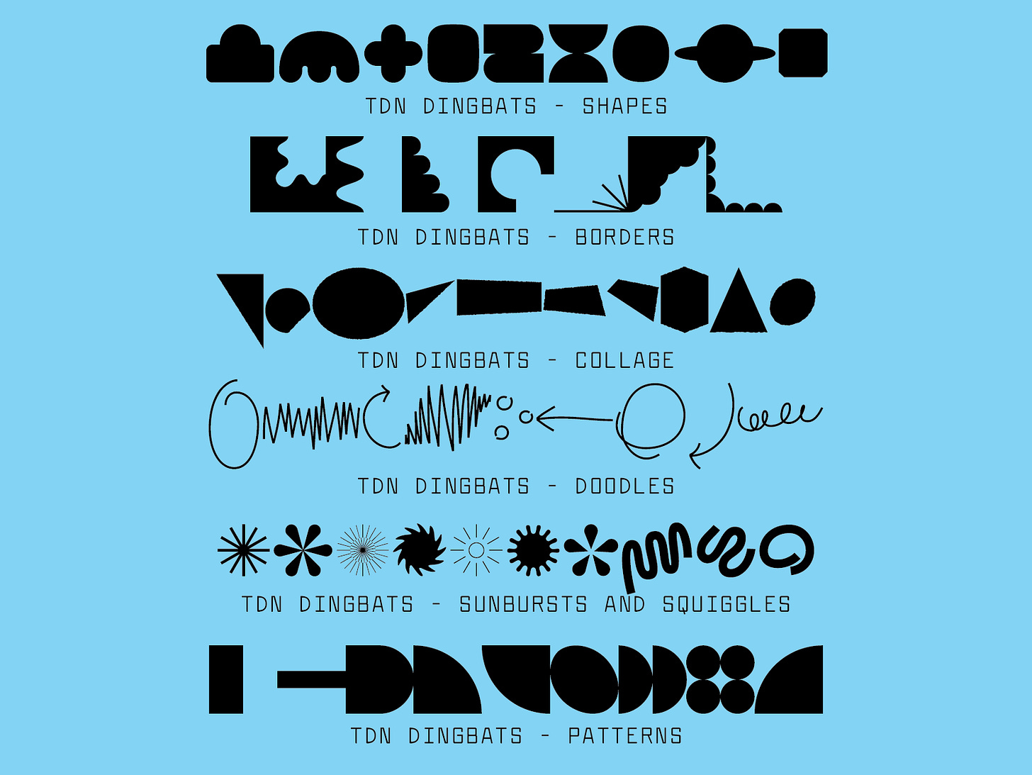
This week, I’d love to discuss my plans for fonts + releases! I have a lot of thoughts so I am sorry if this is scattered and ramble-y. First, with the TDN site, I am going to release an extended version of my dingbats. They were mostly from the 52 Fonts project and have been up on Creative Market for a bit but I think it’s time that they come live at home on the main site. Plus CM takes a 50% cut and that’s a little much for me.
I recently updated them to include more dingbats and organize the styles a little better. This way they can be purchased together or as a set. I’m not even totally sure that other people like dingbats but I find them indispensable for my own design work. It’s just handy to be able to pull up shapes in Illustrator without the hassle of extra files or “clouds.” Here is a little preview of the dingbat styles:
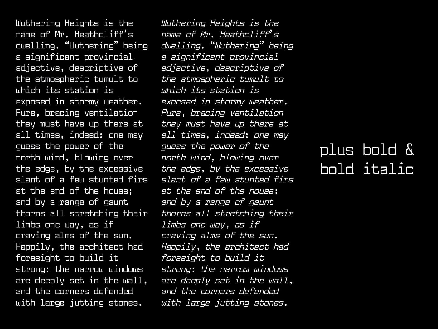
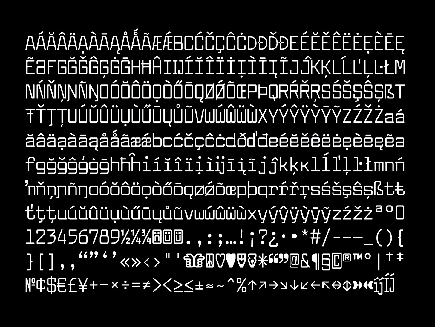
My next font release will be Weightless. I’ve been working on it here and there in recent months. It’s a revival of the typewriter font, Senatorial, from a line of 60’s Olympia typewriters. It’s an incredibly simple typeface design but I find it so easy to use. After I made it for the 52 Fonts project, I kept requiring more characters with every use and then it escalated into diacritics. Now there is a bold and italic in the works!! Here is a little preview of where it’s at:
After Weightless, my plans are quite loose. James Edmonson of OHno Type Co (who we all know and love), recently said something that really stuck with me. I tuned into his live stream of making a font (linked here via the Letterform Archive!), and he mentioned that he likes when his fonts look like a logotype. It shows that they’re doing a lot of heavy lifting for the graphic designers that will use them. Also there’s a huge chance that I am inferring a lot here but I am too lazy to go back and watch the vid. Regardless, it’s a really smart way to think about type design. A lot of us are designing fonts to be used commercially by graphic designers and it will obviously be more appealing to a designer if it does a lot for them.
Of course some fonts are made for other reasons but for me, James hit the nail on the head. If I put my graphic designer hat on and take a look at the fonts I have created, these are the ones that are most appealing/useful to me:
Mr Rightside
One of my 52 Fonts faves! I’d like to experiment with weights and designing it for different sizes. And potentially making the lowercase?
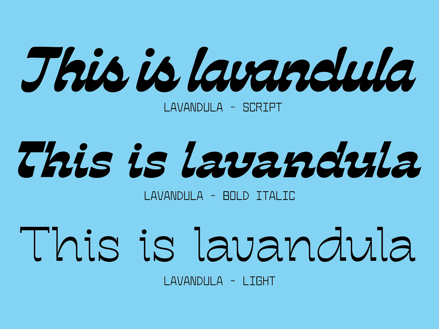
Lavandula
This was my Type West project. It has a lot going for it but it needs A LOT of work and it feels very intimidating to jump back into. The connected script might be worth it tho!!
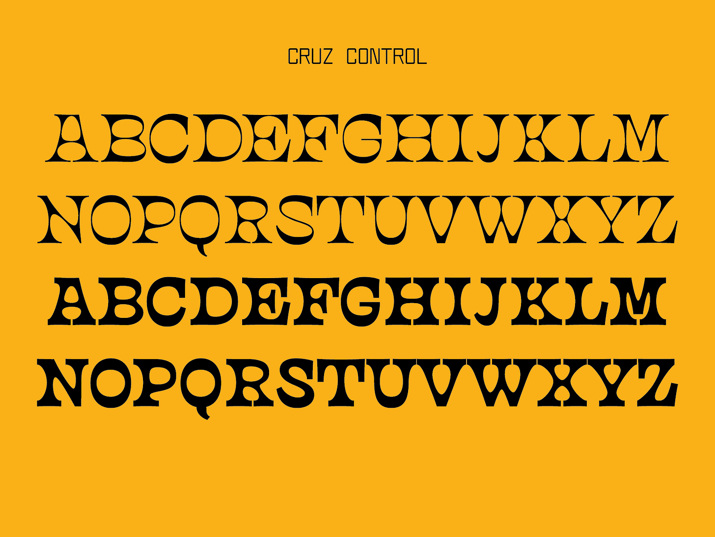
Cruz Control
This was a super funky variable font I made — also from the 52 Fonts project. But something about it is very fun and it totally has logotype energy!!
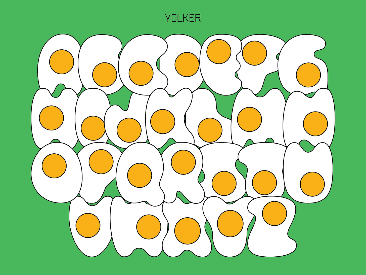
One or more of these might be submitted to Future Fonts as that has been a goal of mine for a bit. I am not sure which ones or when but even if they don’t get accepted, they will become part of the TDN Library someday. And lastly, just for funzies, I want to bring back Yolker somehow. I feel like there’s one cute ass little diner out there that could use it for menu headings. And that’s enough to make it worth my efforts.
So that’s where I am at with font thoughts! There’s a chance that some brilliant new type concept will absolutely upend all my plans, but c'est la vie!!
5 Things I’m Into This Week:
Okay SORRY but has anyone watched Real Housewives of Salt Lake City???? The finale tho?? I’ve been watching RHOSLC since season 1 and it has never been so crazy. Even with Jen Shah!! Highly recommend if you’d like to let your sanity slip away.
Also I have been trying to spend less time on social media (cough cough tiktok) and so I have become re-obsessed with Sims Freeplay on my ipad. I don’t know if it’s healthier but it’s surely less toxic!
I am on vacay this week (woo!!) and for sun protection, I’ve been wearing this trucker hat and it’s honestly one of my fave purchases of last year. It’s a good convo starter!! I bought mine from a random grocery store in Gualala, CA last summer <3
Gluten free oatmeal, coconut, and raisin cookies from Trader Joe’s!!
This song from my all time fave, Megan Thee Stallion. <3
Talk soon!!
Libbie
P.s. — There are still a few spots in my January Revival class!!! Check it out here <3



I love these gorgeous little fonts and I also want to use Yolker someday!
Weightless is gorgeous, indeed! Looking forward for more beautifulness, the world needs it!